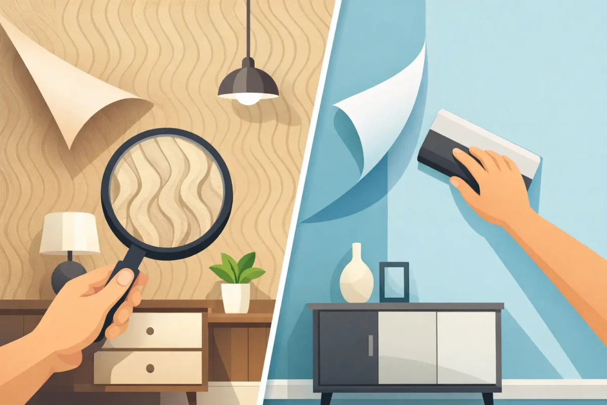
A wall is no longer a passive backdrop. It can establish the identity of a hotel lobby, bring calm to a private bedroom, direct movement through a retail space, or make a workplace feel unmistakably on-brand. The most compelling interior surface printing trends for 2026 reflect this shift: designers are specifying printed surfaces not simply for decoration, but for atmosphere, storytelling, and long-term performance.
For homeowners and project professionals alike, the opportunity is far greater than choosing a pattern from a sample book. High-resolution digital printing, increasingly refined substrates, and custom sizing make it possible to treat every wall as a considered design element. The strongest results pair visual confidence with the right material, finish, and installation standard.
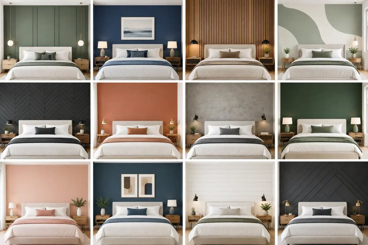
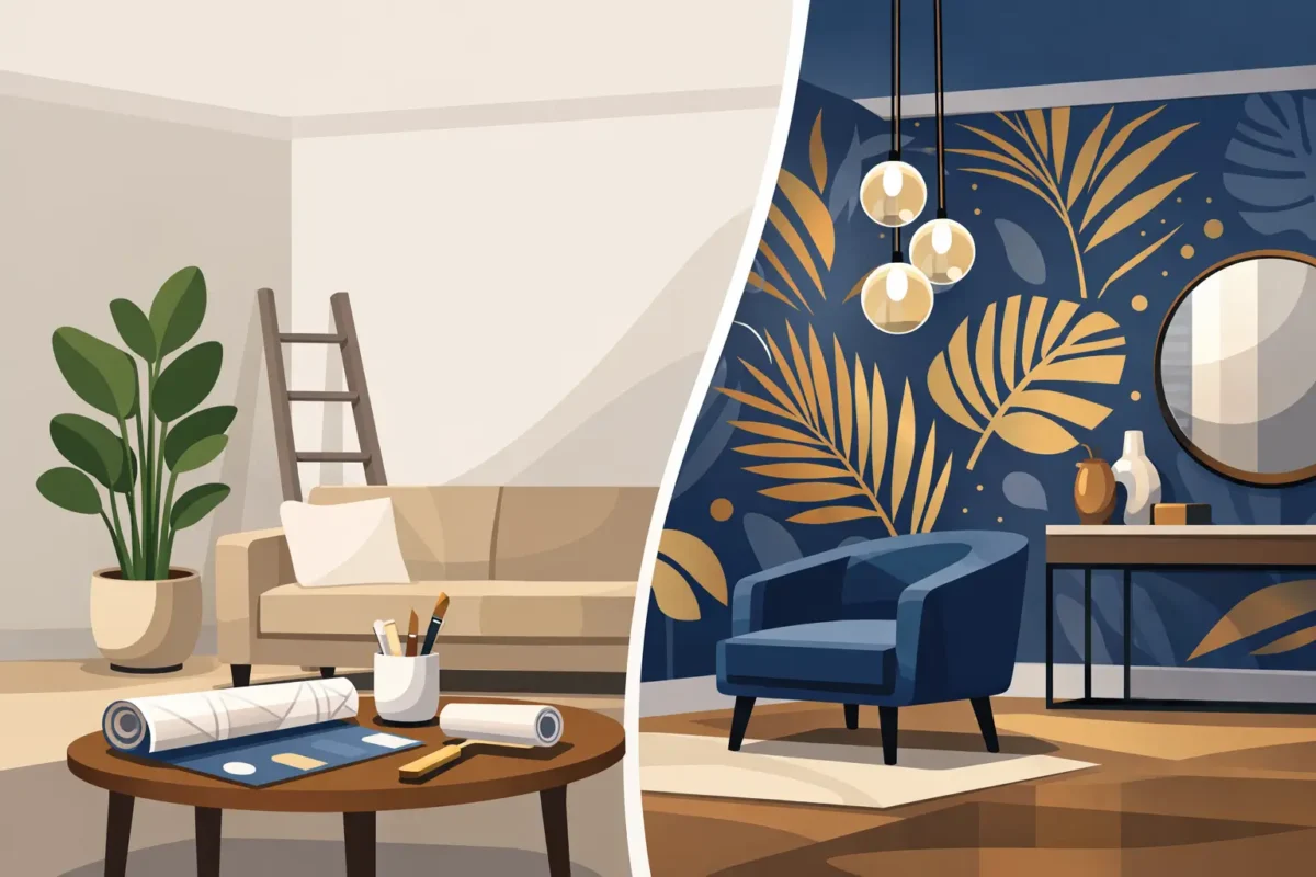
The era of a single generic accent wall is giving way to more intentional surface design. Instead of applying wallpaper as a finishing touch, designers are using it earlier in the planning process to define zones, reinforce a concept, and create a memorable point of view.
This is especially visible in hospitality, retail, and branded commercial interiors. A mural can turn a corridor into an experience, while a finely textured wallcovering can make a reception area feel more composed and premium. In residential projects, printed surfaces are being used to frame headboards, enrich dining rooms, and introduce scale where furniture alone cannot.
The trade-off is that a high-impact wall has to be designed with discipline. Large-scale printing can elevate a room, but an overly busy image, poor panel alignment, or a finish unsuited to the space can undermine the effect. Successful specification begins with the architecture, lighting, viewing distance, and expected daily use.
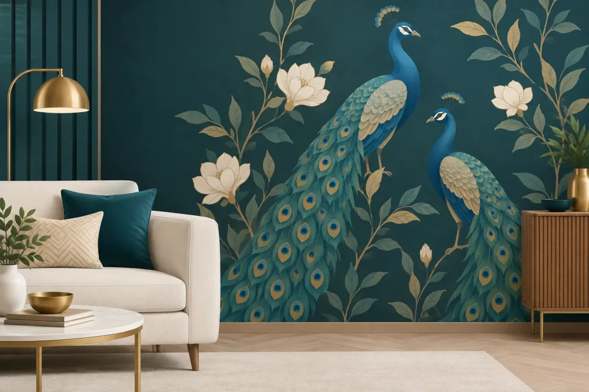
Custom murals remain one of the clearest directions in interior surface design, but the trend has matured. The focus is less on placing a dramatic image on one wall and more on creating artwork that belongs to the room’s proportions and purpose.
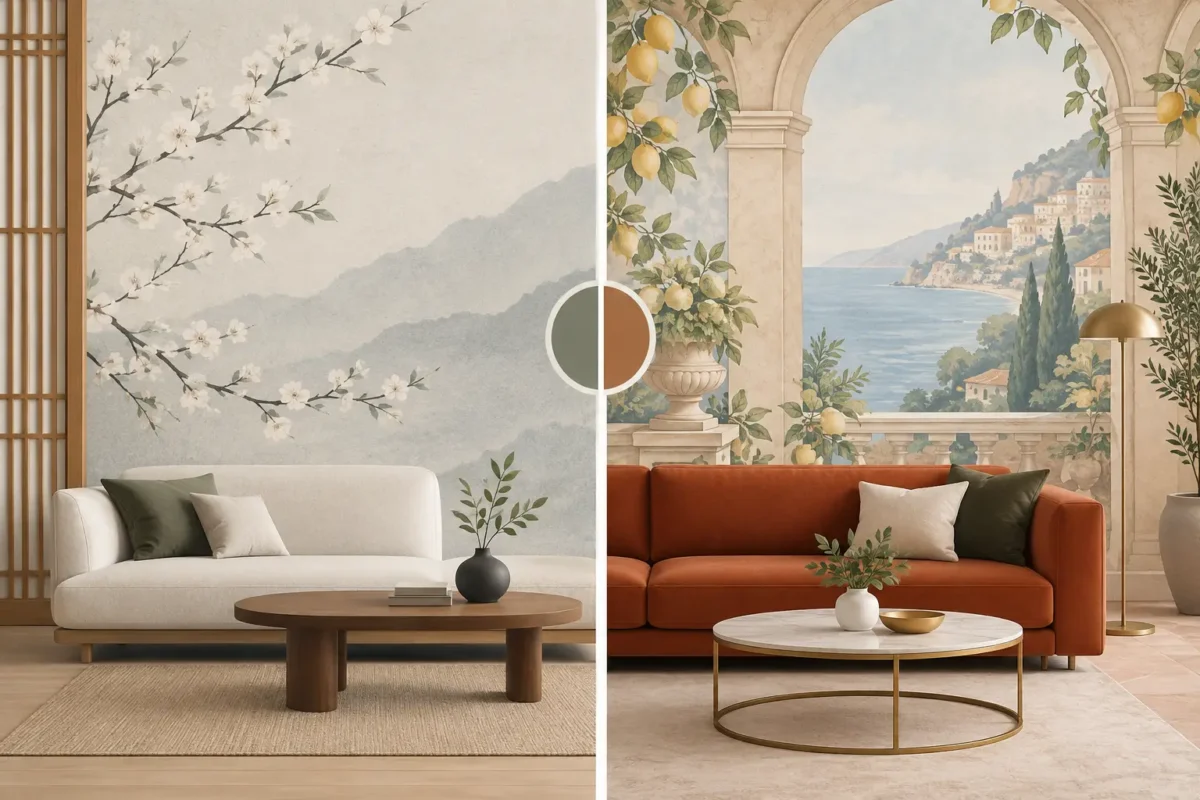
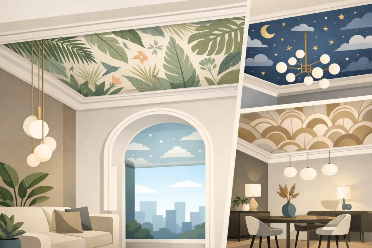
Overscaled botanicals, atmospheric landscapes, hand-drawn city studies, abstract washes, and quietly layered geometric compositions are all being tailored to exact wall dimensions. This prevents an important visual feature from feeling cropped, repetitive, or accidental. A design can be positioned around doorways, built-ins, headboards, and feature lighting rather than forced to fit afterward.
For commercial settings, custom print also creates a direct route to brand expression. A restaurant may use a locally inspired illustrated mural, while a corporate office may translate brand colors, values, or regional references into an original wall graphic. The goal is not to place a logo everywhere. It is to create an environment with a recognizable character.
Image quality matters here. Source files need sufficient resolution for the final wall size, and color should be reviewed against the actual lighting conditions. A warm lobby, a daylight-filled showroom, and a low-lit lounge can each change how a printed palette is perceived. Professional proofing is a worthwhile step when color accuracy is central to the project.
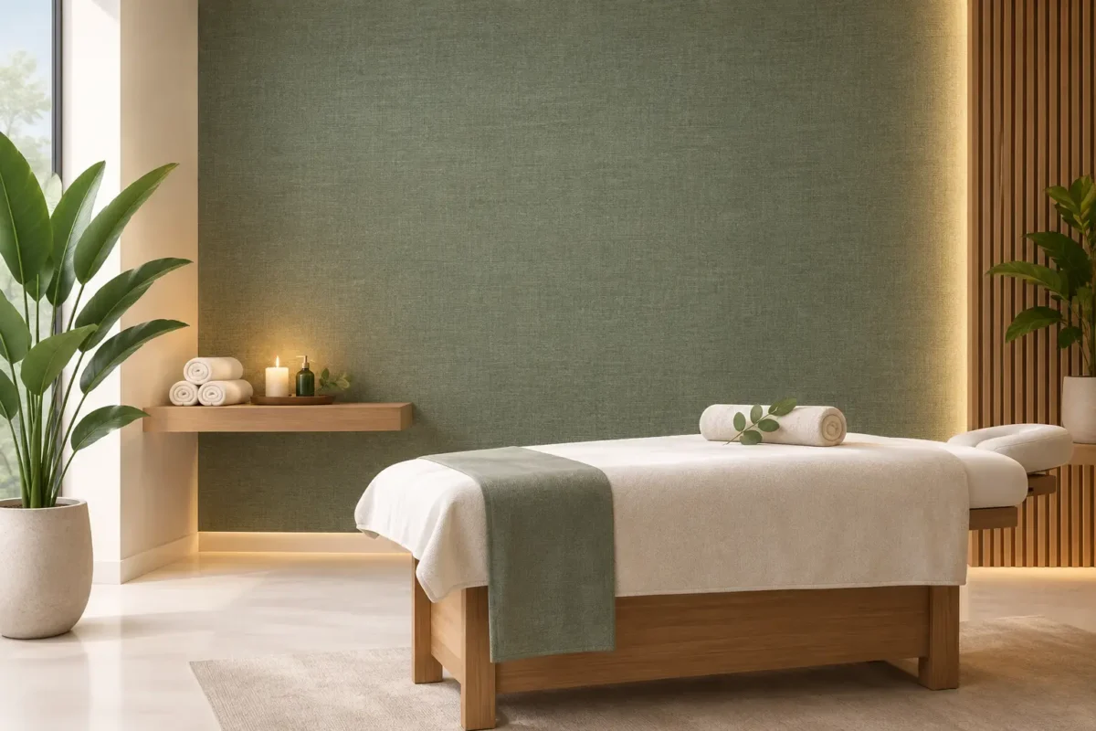
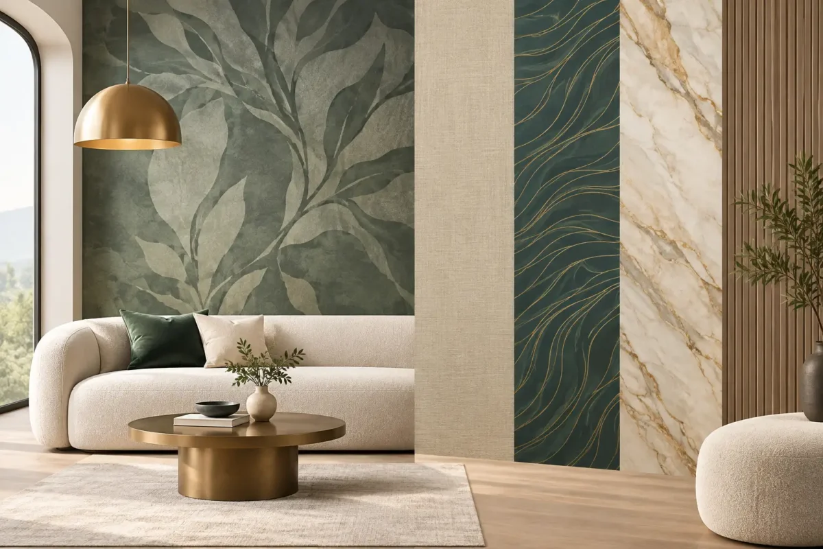
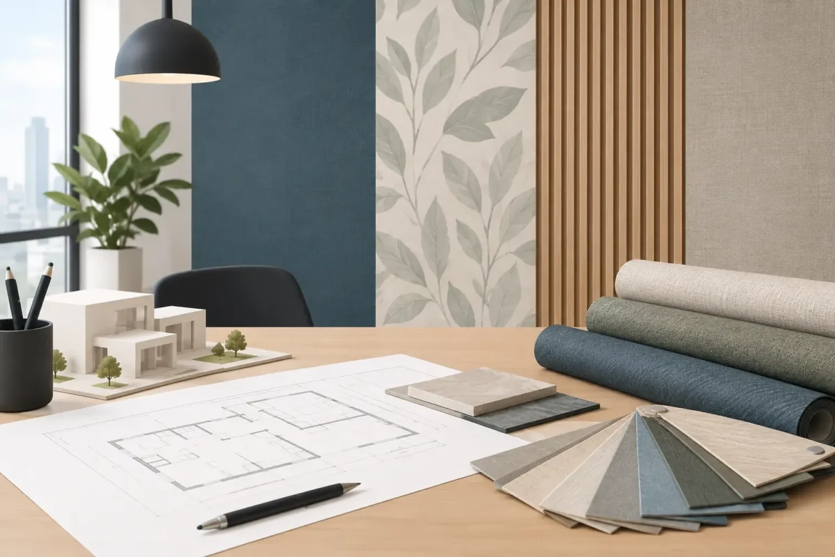
Printed design is increasingly being selected for the way it feels as well as the way it looks. Linen-like grains, woven effects, plaster-inspired surfaces, soft suede appearances, grasscloth visuals, and subtly embossed patterns offer depth without the maintenance limitations of some natural materials.
This direction suits clients who want a refined interior but do not want every surface to demand attention. A tonal wallcovering with a textile effect can soften acoustics visually and add warmth to a minimalist room. In hotels, offices, and high-end residences, these restrained finishes often create a more enduring result than a highly decorative motif.
The distinction between a printed texture and a true textured wallcovering should be understood before selection. A printed effect can deliver consistent color, custom scale, and easier coordination across large areas. A physical texture introduces richer shadow and touch, yet may require more care and may be less suitable for areas exposed to frequent cleaning. The best choice depends on the intended experience and the practical demands of the space.
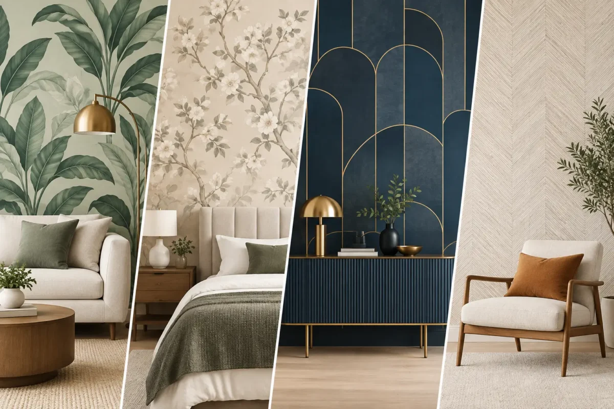
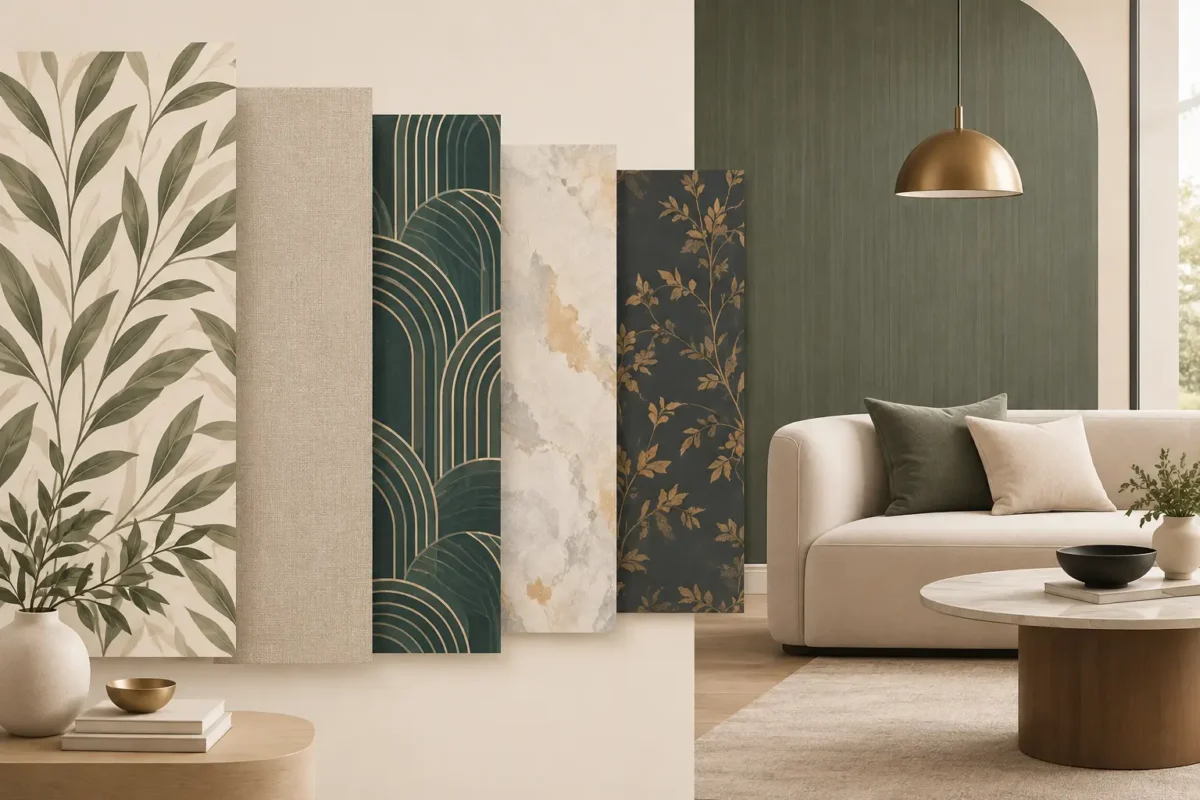
Biophilic design continues to influence print direction, but the palette is becoming more sophisticated. Expect mineral green, clay, sand, tobacco, deep blue, muted terracotta, and warm off-white to take precedence over bright novelty colors. These shades work particularly well with natural stone, timber, brushed metal, and soft upholstered finishes.
Botanical imagery is also becoming less literal. Rather than crisp tropical leaf repeats, designers are leaning toward shadowy foliage, painterly florals, misted forest scenes, and abstract references to water, earth, and sky. The effect is restorative without becoming theme-driven.
This trend is highly adaptable. A soft landscape mural may bring serenity to a bedroom or wellness space, while a darker botanical composition can give a restaurant or lounge an intimate, layered mood. Scale is the deciding factor. Smaller rooms often benefit from open compositions and lighter values, while expansive public spaces can carry stronger contrast and denser detail.
The most valuable interior surface printing trends are not only aesthetic. Architects, developers, and facility teams are placing greater importance on wall finishes that support the real conditions of the site. For a project-grade specification, visual appeal must sit alongside durability, cleanability, fire performance, and installation requirements.
Fabric-backed commercial wallcoverings remain a strong choice for corridors, guestrooms, meeting rooms, healthcare-adjacent environments, and other high-traffic applications. Their structure is suited to demanding walls and repeated use, while modern printing allows them to carry nuanced patterns and custom artwork. Where required, fire-retardant ratings should be verified against the project specification and local code requirements rather than assumed from a product category.
Washable finishes are another practical priority. In family homes, retail spaces, dining environments, and busy offices, easy maintenance can preserve the appearance of a wall long after installation. However, not every substrate is intended for the same cleaning method. Abrasion resistance, stain exposure, humidity, and cleaning chemicals should all guide material selection.
Environmental considerations are also shaping decisions. Low-odor, eco-conscious ink systems and responsibly selected substrates can support healthier interior goals, particularly in occupied commercial and hospitality projects. These benefits should be evaluated with the full product specification in mind, including the adhesive, wall preparation, and intended service life.
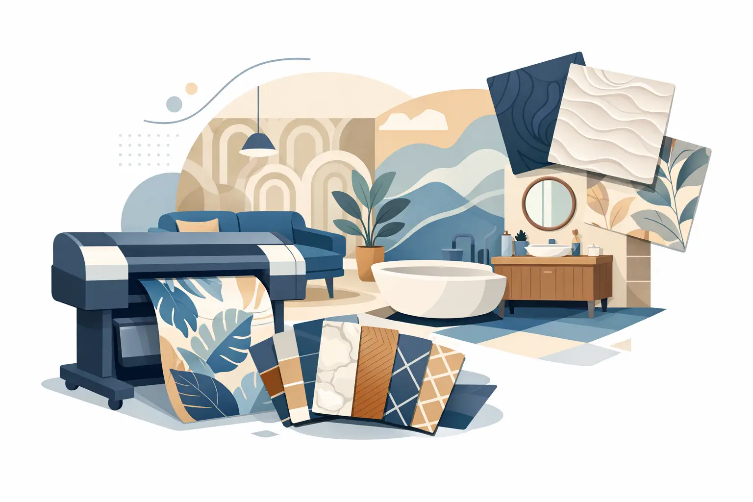
Large-format digital printing gives designers remarkable flexibility, from one-off art walls to coordinated surface programs across multiple rooms. It also raises the standard for execution. A beautiful file alone does not guarantee a beautiful installation.
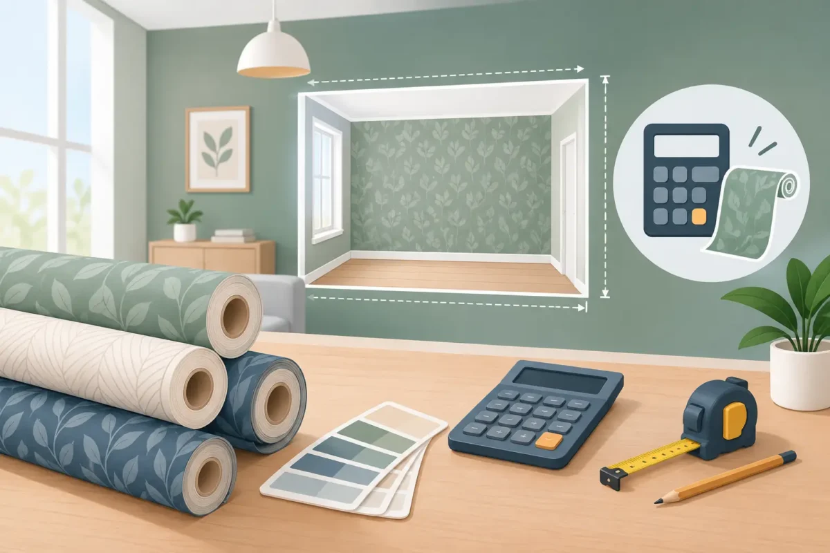
Wall measurements should account for corners, ceiling variation, openings, and architectural details. Murals need a clear panel map so the image aligns correctly from the main viewing point. Existing wall conditions matter too: uneven surfaces, moisture, loose paint, and poor priming can affect adhesion and the final appearance.
Lighting deserves equal attention. Raking light can reveal wall imperfections and seams, while a change from daytime to evening lighting can shift the perceived tone of a printed design. For premium projects, reviewing material samples under the intended lighting is more reliable than making a decision under showroom illumination alone.
Professional installation is not an add-on to a printed wall finish. It is part of the finished product. Precise pattern matching, clean trimming, proper adhesive selection, and careful handling of panels protect both the visual investment and the performance of the wallcovering.
The right trend should serve the room rather than compete with it. Begin with the desired feeling: calm, energetic, intimate, polished, playful, or distinctly branded. Then consider how much visual activity the furnishings, flooring, and lighting already introduce. A richly patterned mural may be ideal in a spare lobby, while a textured neutral may be the more effective choice in a room with statement furniture.
For long-term projects, avoid choosing solely from a small swatch or a digital screen. Request a meaningful sample, review it in the space, and ask practical questions about substrate, cleaning guidance, fire performance, lead time, and installation. Custom printing offers exceptional freedom, but it works best when design decisions and technical requirements are resolved together.
The most memorable interiors will not follow every trend. They will use print, texture, color, and material performance with enough intention that the finished wall still feels right long after the first impression.