A blank wall behind a reception desk, bed, dining table, or retail display can make even a well-furnished room feel unfinished. Bricks wallpaper introduces the visual weight of masonry without the dust, structural work, uneven surfaces, or space loss associated with real brick. It is a design finish that can feel industrial, heritage-inspired, urban, contemporary, or quietly luxurious depending on the color, scale, and material selected.
For homeowners and design professionals, the appeal is not simply a brick pattern. It is the ability to create architectural character with greater control over performance, budget, installation timing, and maintenance. A well-chosen wallcovering can turn one wall into a focal point while keeping the wider interior polished and purposeful.
Real brick has undeniable presence, but it is not automatically the right finish for every project. It can be heavy, costly to build, difficult to clean, and impractical in high-rise residences, leased commercial units, and spaces where construction schedules are tight. Brick-effect wallpaper achieves the visual depth of staggered courses, mortar lines, weathered faces, and tonal variation while remaining a far more flexible surface solution.
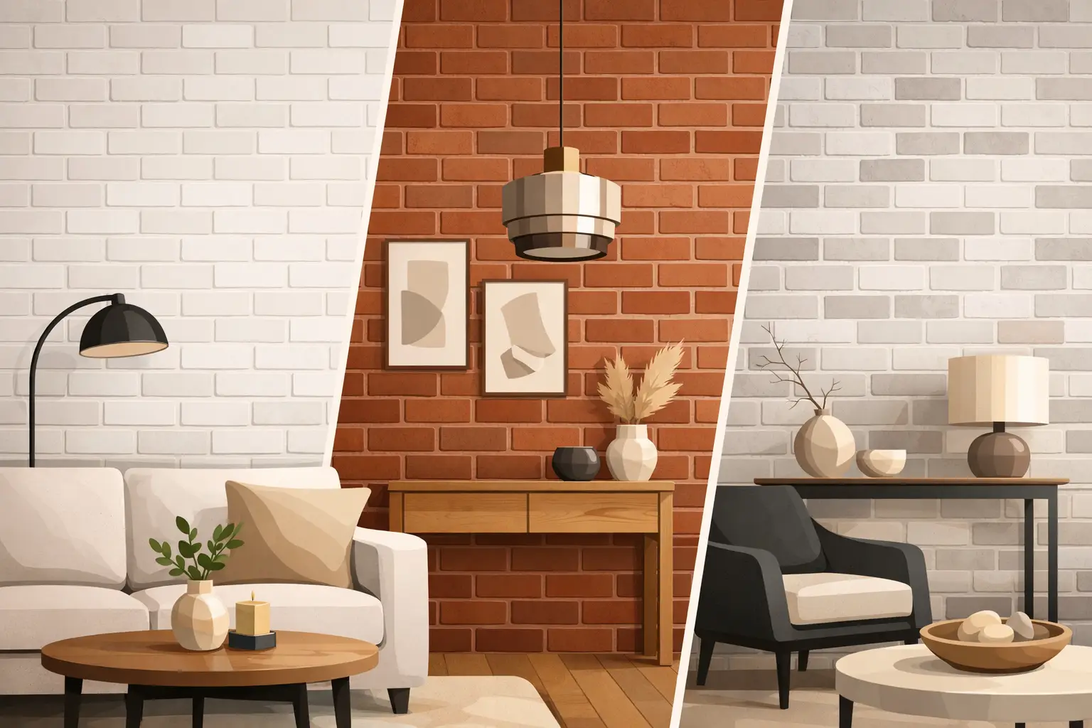
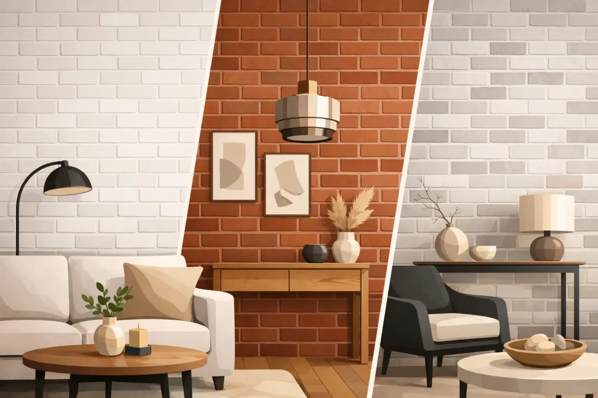
The strongest designs avoid the flat, repetitive look often associated with older printed wallpapers. High-resolution printing can reproduce layered colors, small imperfections, shadowing, and material variation that make masonry convincing from a natural viewing distance. A whitewashed brick design can brighten a compact apartment. Charcoal or deep red brick can anchor a restaurant or lounge. Soft gray, taupe, and sand-toned brick offer texture for offices, bedrooms, and hospitality spaces without making the room feel overly themed.
The trade-off is straightforward: wallpaper provides the appearance of tactile masonry, not the physical texture or thermal mass of a brick wall. For most feature walls, that is an advantage. The surface stays flatter, furniture sits neatly against it, and the design remains easier to refresh when a property evolves.
The right bricks wallpaper should support the architecture, furnishings, lighting, and intended mood of the room. Before focusing on a favorite color, consider whether the wall needs to recede, frame a feature, or become the main visual statement.
Traditional red brick brings familiarity and richness. It works particularly well with timber, black metal, leather, warm lighting, and neutral upholstery. In a home, it can give a dining area or entertainment room a more settled, layered feel. In retail and food-and-beverage settings, it can create an inviting backdrop that feels established rather than temporary.
Look for designs with varied red, rust, brown, and charcoal tones rather than a single uniform shade. Variation gives the wall credibility and helps it work with natural light throughout the day. Red brick can feel visually strong in a smaller room, so a single feature wall is often more effective than covering every surface.
White, cream, and pale gray brick patterns bring texture without absorbing too much light. They are especially useful in condominiums, narrow corridors, bedrooms, and smaller commercial spaces where a darker wall may feel enclosing. The effect is relaxed but still architectural.
A whitewashed finish is not always stark. Some designs reveal warm brick undertones beneath a faded painted surface, adding softness and depth. Pair this direction with oak, linen textures, brushed brass, or matte black details for a finish that feels considered rather than rustic.
Cool gray brick sits naturally within contemporary interiors, especially where the palette includes stone, glass, dark joinery, or polished metal. It is a popular choice for meeting rooms, cafés, apartments, studios, and office feature walls because it has structure without demanding too much attention.
The shade matters. Pale gray can feel clean and open, while graphite, slate, and blackened brick create drama. In rooms with limited daylight, balance darker finishes with layered lighting and lighter flooring or furniture. A dark wall should feel intentional, not like a visual dead end.
Aged brick imagery, chipped plaster effects, faded paint, and irregular mortar lines suit boutique hospitality, creative workspaces, specialty retail, and homes with vintage or industrial influences. These patterns add a sense of history quickly, even in a new-build setting.
Use them with restraint. When a wallcovering already has heavy distressing, heavily weathered furniture and multiple industrial accessories can make the room feel overworked. Clean-lined furnishings, thoughtful lighting, and one or two contrasting refined surfaces keep the result elevated.
Design is only half of the decision. The wallcovering construction should reflect the demands of the environment. A low-traffic bedroom feature wall and a busy hotel corridor should not be specified in the same way simply because they share a preferred brick design.
Non-woven wallpaper is valued for its stable handling, clean finish, and suitability for many residential applications. It is a practical choice for feature walls where visual precision matters and the wall receives normal daily use. Depending on the product, it may also offer easier removal during future renovations.
For kitchens, children’s areas, retail spaces, offices, and hospitality environments, washable vinyl or commercial-grade fabric-backed wallcovering can be the more appropriate solution. These materials are better equipped to handle scuffs, routine cleaning, and higher contact levels. Project requirements may also call for fire-retardant performance, specified durability standards, or particular maintenance criteria.
Printed quality matters just as much as construction. A refined brick design needs crisp mortar lines, believable color transitions, and consistent alignment from panel to panel. Custom-print capability also gives designers greater control over scale, color adjustment, mural composition, and wall-specific sizing, which is valuable for large lobbies, branded spaces, and unusual wall dimensions.
Brick patterns are directional, and a little planning prevents an otherwise attractive design from looking accidental. Start by identifying the wall people see first when entering the room. This may be the wall behind a headboard, a reception counter, a television, a dining banquette, or a merchandising display.
Next, consider viewing distance. Large-format brick can look striking across a hotel lobby or open-plan living area, but it may overwhelm a compact powder room. Smaller brick formats can create intimacy, although overly fine patterns may appear busy from across a larger space. The scale should relate to the room, not only to a sample book.
Lighting changes the result dramatically. Warm downlights bring out red, brown, and taupe tones, while cooler daylight can emphasize gray and blue undertones. Requesting a sample and viewing it against existing flooring, cabinetry, fabrics, and paint colors is a practical step for any significant project. This is especially valuable when the wallpaper must coordinate with a brand palette or a carefully specified hospitality scheme.
Also account for doors, windows, built-in cabinetry, electrical points, and air-conditioning grilles. A professional measure helps establish where pattern joints will fall and whether the composition should be centered around a focal element. On a brick design, misaligned courses are far more visible than on a soft abstract pattern.
Even a premium wallcovering can lose impact if the installation is rushed. Walls should be dry, smooth, clean, and properly prepared before hanging begins. Existing cracks, uneven patches, moisture issues, and poorly repaired surfaces can show through or compromise adhesion over time.
Professional installers understand how to align repeated patterns, manage corners, trim around fixtures, and preserve straight horizontal brick lines. This is particularly important for darker designs, large murals, and commercial walls viewed at close range. In project environments, coordinated installation also helps protect adjacent finishes and maintain construction schedules.
For custom murals or oversized brick compositions, accurate wall measurements are essential. A made-to-measure design can be positioned around a logo, headboard, doorway, or display system rather than cut down to fit after production. That level of control turns a decorative finish into part of the architecture.
A brick-effect wall should do more than imitate a building material. It should give the room depth, identity, and a finish that can stand up to how the space is actually used. Choose the pattern with the same care as flooring or joinery, then let the wall set a confident tone for everything placed around it.