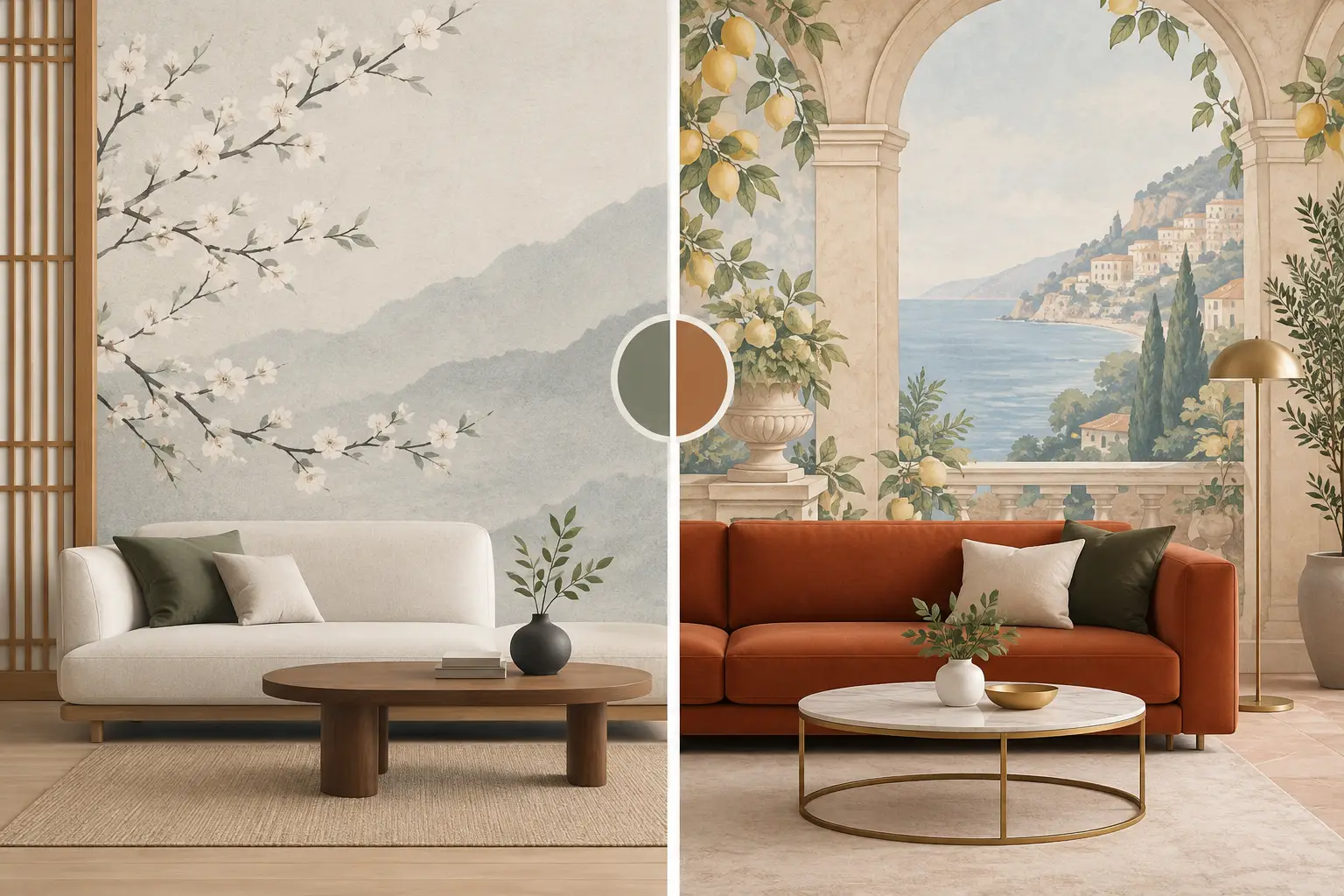
A wallcovering can make a quiet guest room feel considered, give a retail interior a recognizable identity, or bring warmth to a high-traffic hotel corridor. That is why Korean versus Italian wallpaper is not simply a question of origin. It is a decision about visual language, material feel, installation requirements, budget, and how the finished space needs to perform over time.
Both categories offer impressive design possibilities. Korean wallpaper is widely valued for its breadth, contemporary styling, and practical appeal. Italian wallpaper is often selected for its elevated artistry, refined textures, and fashion-led collections. The right choice depends on the effect you want to create and the demands of the project behind the wall.
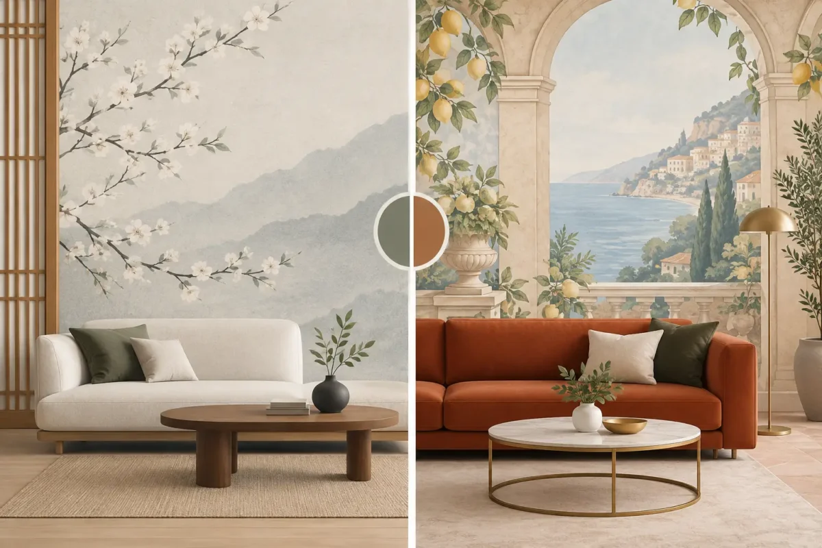
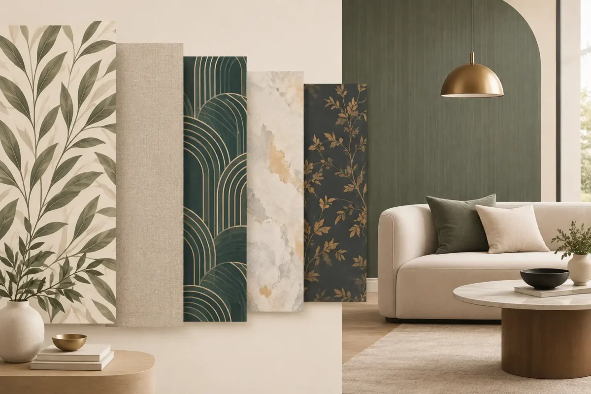
Korean wallpaper is often associated with clean, versatile design and strong value across residential and commercial interiors. Many collections feature soft neutrals, linen effects, subtle geometrics, botanical motifs, cement finishes, and tactile-looking surfaces that suit modern Asian, Scandinavian, transitional, and minimalist spaces. It gives designers considerable freedom to build a polished room without making every wall compete for attention.
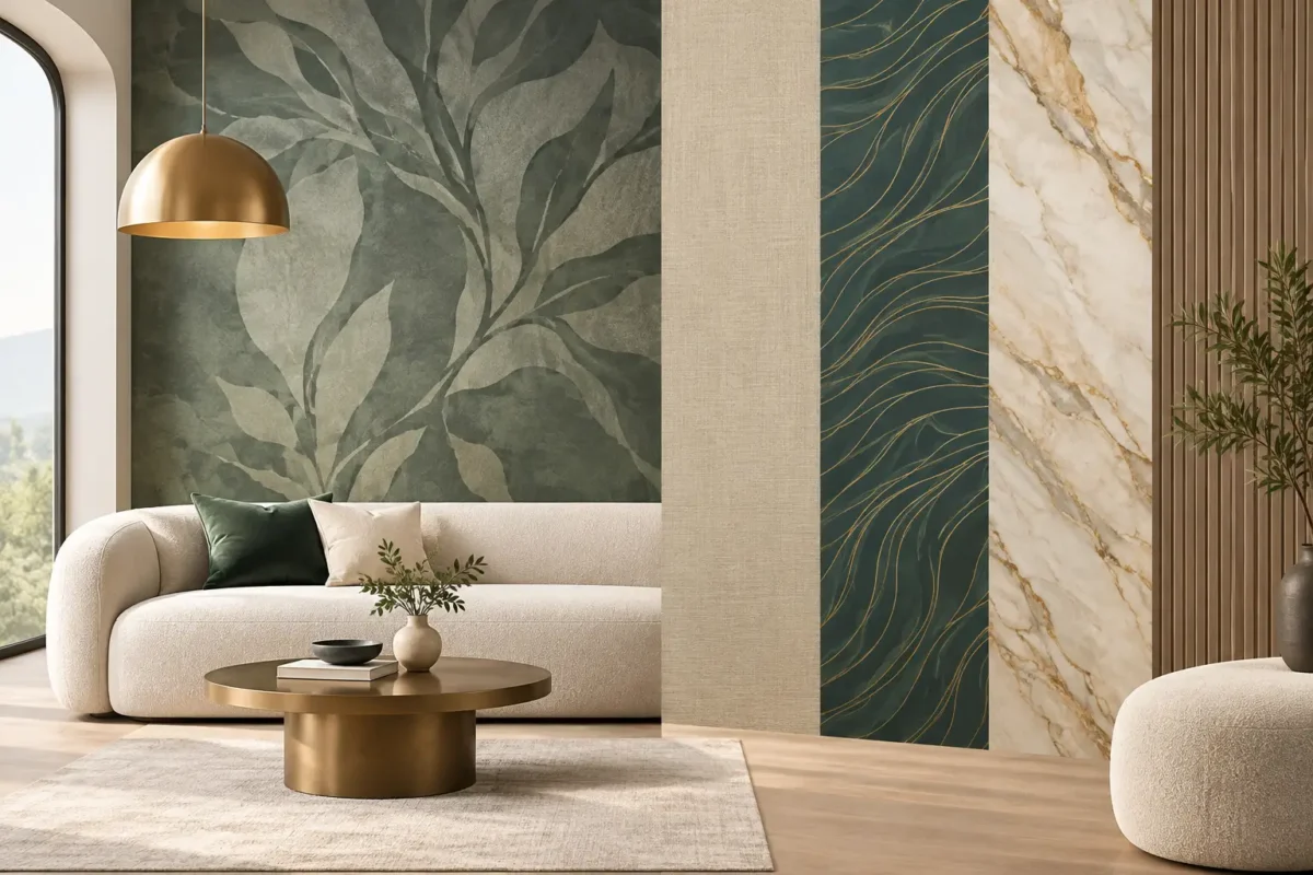
Italian wallpaper typically leans more expressive in both materiality and visual detail. Expect layered textures, painterly florals, metallic accents, heritage-inspired motifs, sophisticated mural effects, and highly curated color stories. Italian design houses frequently treat wallpaper as a defining decorative element rather than a background finish. A single feature wall can establish the atmosphere of a dining room, boutique, reception area, or premium suite.
Neither is automatically better. Korean collections may be the smarter fit when a project requires coordinated finishes across many rooms, practical maintenance, and a controlled budget. Italian collections can be ideal when the wallpaper must deliver a stronger sense of craft, luxury, or visual distinction.
The most immediate difference is often the mood each wallpaper creates. Korean designs commonly excel at restraint. Their patterns may be delicate, their textures quiet, and their palettes easy to layer with timber, stone, upholstery, and contemporary lighting. This makes them especially useful in bedrooms, living rooms, offices, and multi-unit residential developments where a timeless finish matters more than a short-lived trend.
That restraint does not mean Korean wallpaper lacks personality. A finely textured weave, soft pearl finish, organic plaster effect, or large-scale leaf pattern can add depth without overwhelming the furniture or architecture. In compact rooms, this controlled visual weight can make the space feel calmer and more expansive.
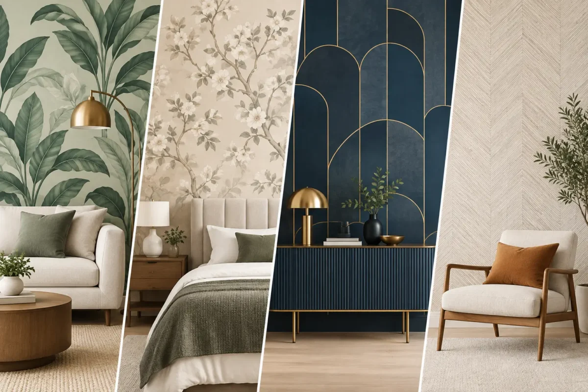
Italian wallpaper often invites a more decorative approach. Rich damasks, artistic botanical studies, hand-painted appearances, and dimensional surface effects are designed to be noticed. It can bring drama to a lobby, create intimacy in a private dining room, or turn a master bedroom wall into an architectural focal point.
The trade-off is balance. A highly detailed Italian pattern needs a clear role in the room. It may work best on one main wall, above wainscoting, or within a defined zone such as a headboard wall. When used across every surface in a small or heavily furnished room, it can feel visually crowded. Korean wallpaper is generally more forgiving when it is applied to multiple walls.
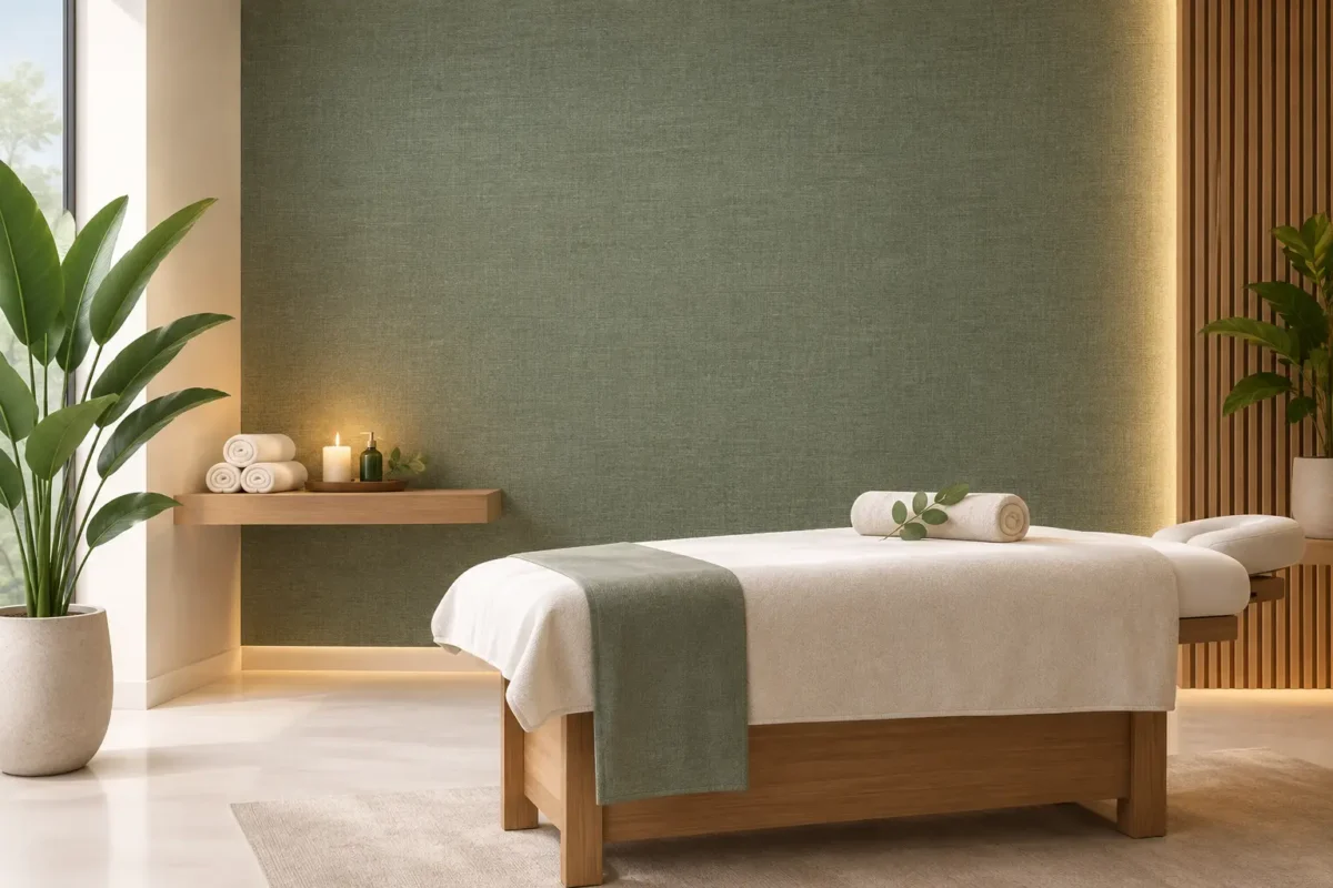
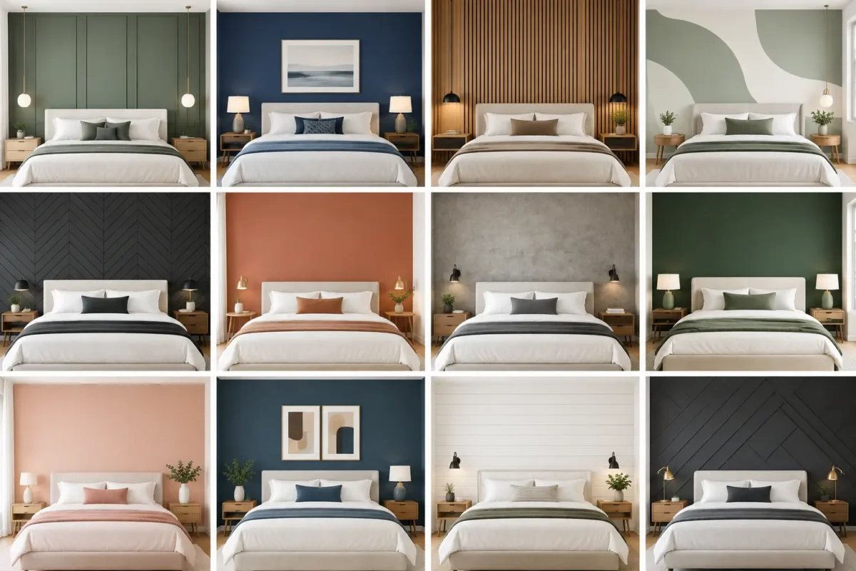
For interiors built around neutral finishes, Korean wallpaper offers a broad foundation of warm whites, greiges, taupes, misty blues, and soft earth tones. These shades coordinate easily with built-in cabinetry, natural flooring, and changing accessories. They are a practical choice for spaces that may be refreshed over the years.
Italian collections often make color part of the statement. Deep greens, mineral blues, terracotta, antique gold, charcoal, and layered jewel tones can create an immediate sense of place. This is valuable for hospitality and retail projects where the interior needs to be memorable, brand-aligned, and photographically strong.
Wallpaper should be assessed with the hand as well as the eye. Product photography can show pattern and color, but it cannot fully communicate embossing, sheen, thickness, or the way a surface responds to light.
Korean wallpaper commonly offers practical vinyl and paper-backed options with embossed textures that replicate linen, silk, plaster, leather, or natural fiber. These finishes can introduce warmth and dimension while remaining approachable for larger installations. Many are designed for easy cleaning, making them well suited to family homes, offices, and active commercial spaces.
Italian wallpaper is often recognized for more complex surface development. Depending on the collection, it may feature raised inks, layered printing, metallic highlights, flock-like effects, textile-inspired grounds, or carefully controlled matte and gloss contrasts. The result can feel exceptionally rich under ambient lighting, particularly in lounges, suites, meeting rooms, and high-end residences.
However, texture should match the environment. A delicate, deeply textured, or metallic finish may need more careful placement away from heavy contact areas. For corridors, children’s rooms, service zones, or busy retail settings, a durable, wipeable wallcovering with a less vulnerable finish can be the wiser specification.
For professional projects, wallpaper selection must go beyond aesthetics. Maintenance needs, substrate condition, fire requirements, wall traffic, humidity, and installation method all influence the right material.
Korean wallpaper can provide an efficient solution for projects needing consistent quality across a larger number of rooms. Its accessible range of designs and finishes makes it particularly attractive for apartments, offices, clinics, and hospitality guestrooms. Where a wallcovering is selected for residential use, confirm cleaning recommendations and suitability for areas exposed to moisture or frequent contact.
Italian wallpaper can be an excellent premium choice for feature spaces, executive interiors, luxury residences, and boutique hospitality. Yet performance varies by collection, not by country alone. Some Italian products are made for demanding contract environments, while others are intended primarily for decorative residential applications. Always verify the manufacturer’s specifications for washability, fire retardancy, lightfastness, and commercial suitability before final approval.
For high-traffic environments, fabric-backed commercial wallpaper may be more appropriate than either a standard Korean or Italian decorative roll. It is engineered for tougher conditions and can offer superior durability, cleanability, and long-term value. A design-led scheme does not need to compromise on performance when the specification is matched to the site.
Price differences can be meaningful, especially across large wall areas. Korean wallpaper often delivers excellent visual impact at a more accessible price point, allowing homeowners and project teams to allocate budget to lighting, furniture, custom joinery, or professional installation. Its broad availability also makes it easier to create coordinated looks across bedrooms, common areas, and workspaces.
Italian wallpaper usually commands a higher investment because of collection positioning, surface complexity, brand heritage, and specialized production techniques. That investment can be justified when the wallcovering is central to the design concept. A striking Italian feature wall may reduce the need for additional decorative layers, artwork, or expensive architectural treatments.
Value should be measured over the life of the interior, not only by the price of a roll. Consider how long the design will feel relevant, whether it can be maintained easily, how much waste is expected from pattern matching, and whether the chosen installer has experience with the material. A beautifully selected wallpaper can lose its impact if seams, corners, and substrate preparation are handled poorly.
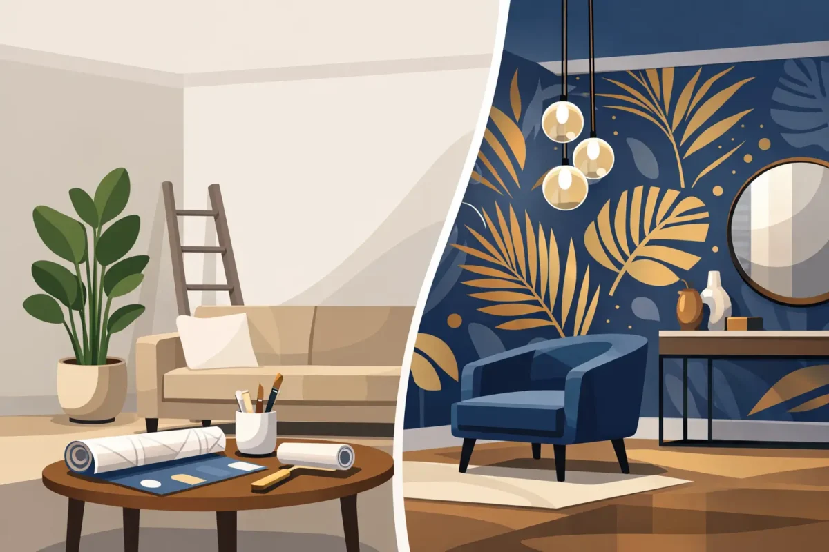
Wallpaper installation is precision work. Walls must be properly prepared, layouts must account for focal points, and patterns must align accurately around doors, windows, corners, and lighting. This is especially critical with large-scale murals, directional designs, metallic details, and textured surfaces.
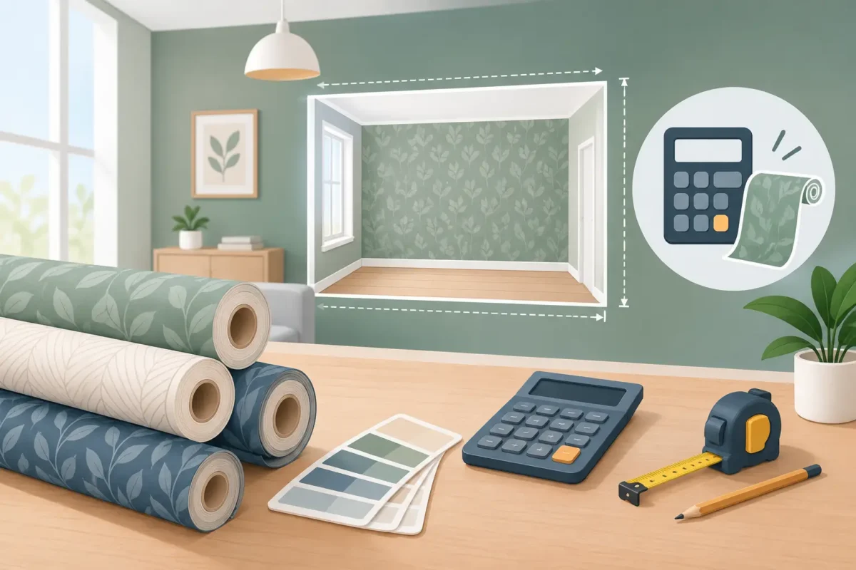
Before ordering, review the wall dimensions, repeat size, roll yield, and any variation between batches. For a large project, order sufficient material from the same batch where possible. For a feature wall, plan the centerline before installation so the most important part of the design lands where it will be seen.
At Decorating Depot, showroom consultation helps clients compare real samples under suitable lighting and align decorative ambition with technical needs. This is often the fastest way to see whether a soft Korean texture or a more expressive Italian statement truly suits the project.
Choose Korean wallpaper when you want refined versatility, coordinated finishes, gentle texture, and strong value across multiple spaces. It is particularly effective when the architecture, furnishings, or views should remain the main focus.
Choose Italian wallpaper when the wall itself needs to carry more of the design story. It is a compelling choice for signature rooms, hospitality concepts, premium client-facing environments, and homes where artful material expression is part of the brief.
If the room faces heavy use, do not select based on appearance alone. Ask for the product’s technical data, consider a commercial-grade alternative where needed, and work with an experienced installer. The most successful wallcovering is not the one that looks best in a sample book. It is the one that continues to look exceptional after daily life, changing light, and years of use have had their say.
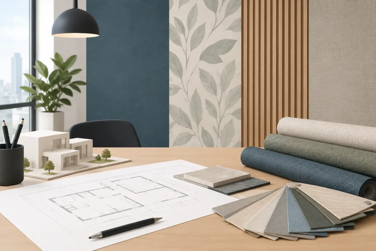
Bring finishes, flooring samples, fabric swatches, and a photo of the room when comparing options. Seeing the materials together turns a general preference into a confident specification – and gives the finished wall the presence it deserves.