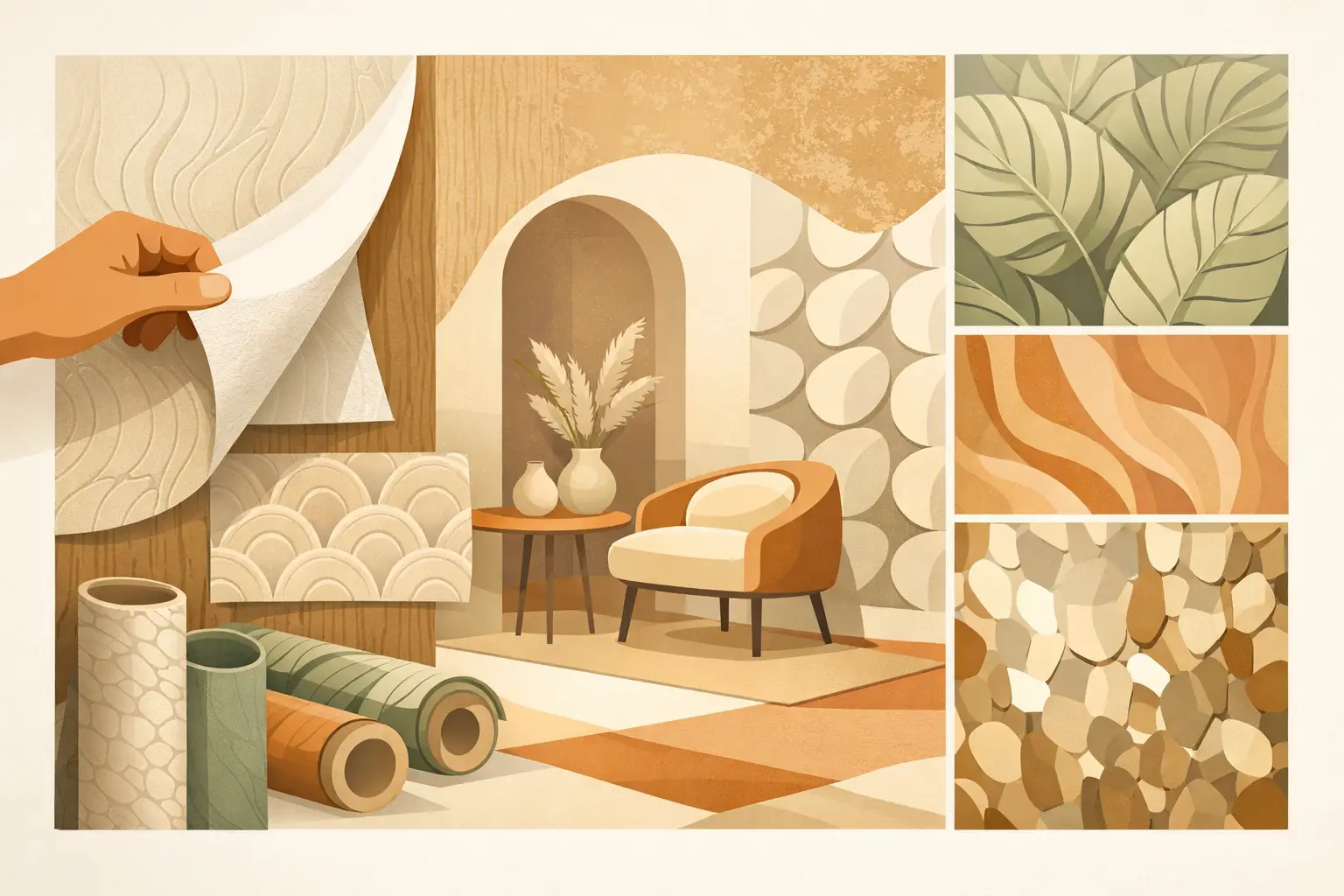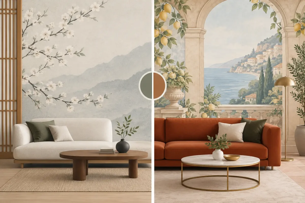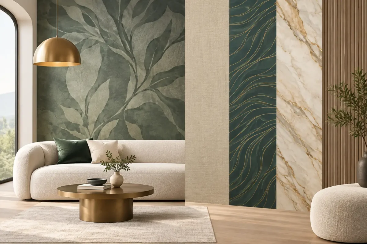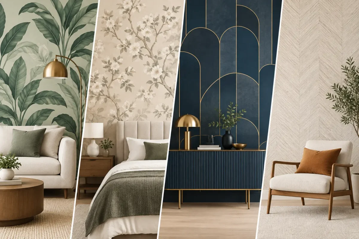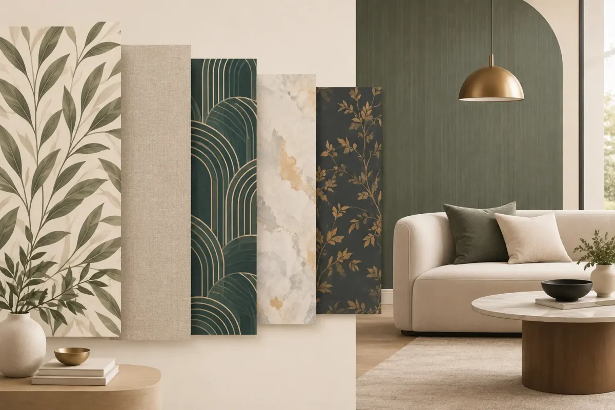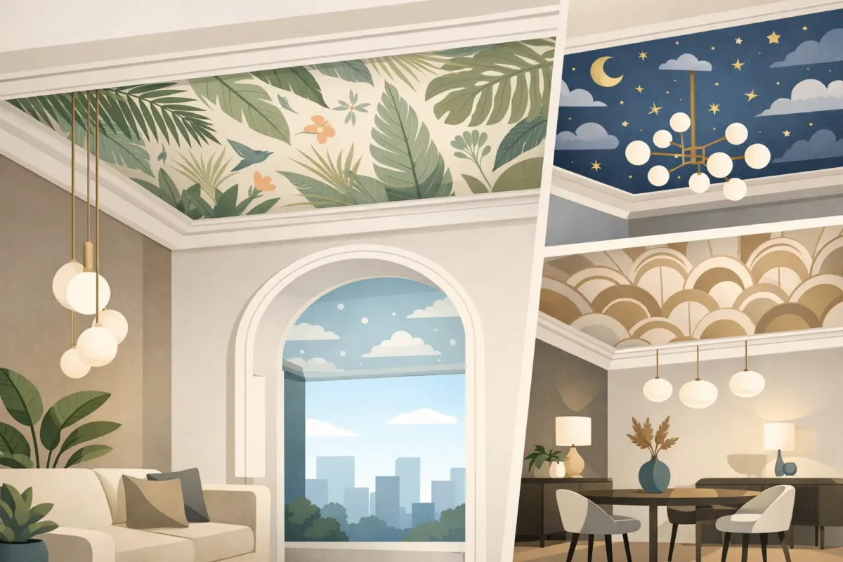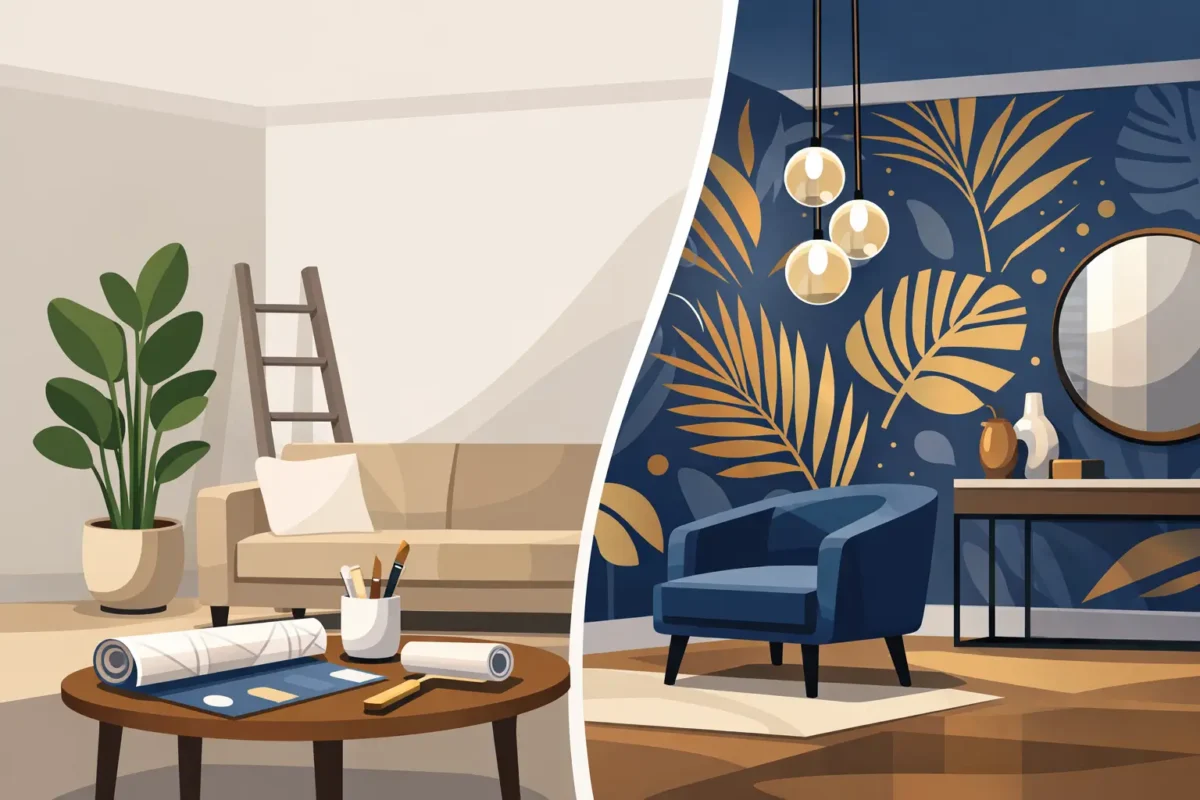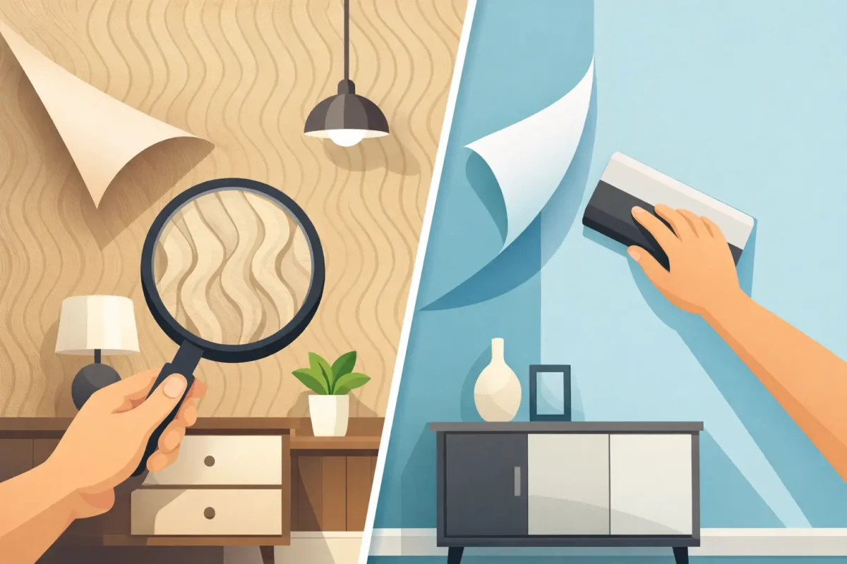
A wall can look beautifully finished in a sample book yet feel flat once it covers an entire room. That is why wallpaper texture trends for interiors are moving beyond surface pattern alone. Designers and property owners are choosing wallcoverings that create shadow, softness, dimension, and a more considered sense of materiality – while still meeting the demands of daily use.
Texture is not a passing decorative detail. It changes how color reads, how light travels through a space, and how a room is experienced at close range. In a residence, it can make a quiet neutral palette feel layered rather than plain. In a hotel lobby, retail environment, or office reception, it adds visual authority without relying on an overly busy print.
Paint offers color, but wallcovering can introduce a tactile quality that gives architecture more presence. A linen-inspired finish softens a crisp contemporary room. Fine grasscloth effects bring organic variation to a formal dining space. Plaster and concrete visuals provide a polished, architectural edge without the weight, dust, or unpredictability of a wet-applied finish.
The strongest textured wallcoverings also work at more than one distance. From across the room, they establish a calm field of color and depth. Up close, the weave, embossing, grain, or layered print rewards attention. This makes them especially valuable in interiors designed for longer dwell time, from bedrooms and private lounges to hospitality suites and executive offices.
Texture also solves a practical design problem: large blank walls can feel unfinished, while bold patterns can quickly dominate a room. A tonal textured wallpaper sits in the middle. It has enough character to complete the space, but it leaves room for furniture, artwork, lighting, and branding to perform.
Refined woven textures remain a leading choice because they make almost any palette feel more expensive. Think warm ivory, oat, mushroom, soft gray, tobacco, and muted mineral blue. These finishes offer the appearance of natural textile without asking a wall to compete with every other element in the room.
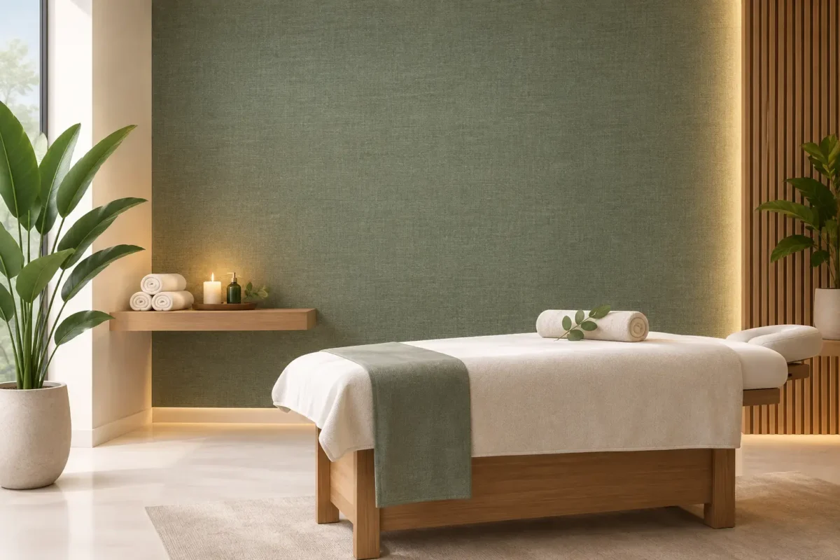
Linen-look wallpaper is particularly effective for bedrooms, corridors, dining rooms, and professional workplaces where the goal is understated warmth. The key is scale. A very fine weave reads as elegant and quiet, while a more pronounced textile pattern can bring welcome character to larger walls or rooms with minimal furnishings.
For commercial projects, choose a project-grade wallcovering rather than a delicate residential paper. Fabric-backed options can deliver the same tailored look with greater resistance to scuffs, daily contact, and regular cleaning.
The appeal of handcrafted surfaces continues, but interiors increasingly need the consistency and maintenance advantages of wallcovering. Plaster-look, limewash-inspired, and mineral-textured designs give walls a layered, atmospheric finish with controlled color and repeatable results.
These textures are well suited to contemporary homes, boutique hotels, restaurants, wellness spaces, and premium retail. They bring depth without the visual hardness of a standard concrete treatment. Warm chalk, sand, clay, putty, stone, and smoky charcoal are especially adaptable because they support both natural materials and more polished finishes such as brass, glass, and lacquer.
There is a trade-off. A highly mottled plaster effect can become visually active across four walls, particularly in compact rooms. It often performs best on a feature wall, behind a bed, around a reception desk, or as a continuous backdrop in a carefully edited space. A subtler tonal version can carry an entire room with more ease.
Natural-looking wall finishes bring a sense of calm that polished flat surfaces cannot replicate. Grasscloth-inspired, raffia-look, jute, sisal, and fine fiber textures are appearing in elevated residential interiors as well as hospitality and executive environments. They pair naturally with timber, stone, leather, boucle upholstery, and warm metal finishes.
Authentic natural wallcoverings have distinctive character, including variation in tone and weave. That individuality is often the point, but it may not suit every application. In high-traffic corridors, humid conditions, or spaces requiring frequent cleaning, a high-performance vinyl or non-woven interpretation can offer a more practical specification while preserving the organic look.
This is where material selection matters as much as design. A texture that feels perfect in a quiet study may not be appropriate for a busy restaurant entrance. The intended use, maintenance routine, lighting, and installation conditions should guide the final decision.
Texture does not always need to imitate a natural material. Embossed lines, raised geometric grids, subtle ribbing, and sculptural repeats bring a more modern form of dimension to walls. These designs are ideal when a project needs a contemporary statement without introducing a strong color contrast.
Vertical ribs can visually lift a low ceiling. Fine horizontal textures may make a narrow wall feel broader. Repeated arcs, fluting, and architectural linework can give a reception area or feature wall a custom-built appearance, especially when paired with directional lighting.
The most successful choices are generally low contrast. A raised pattern in a single tonal color feels composed and enduring. High-contrast geometry can be striking, but it should be selected with care in spaces where people spend many hours. What feels dramatic in a small sample can become tiring at full scale.
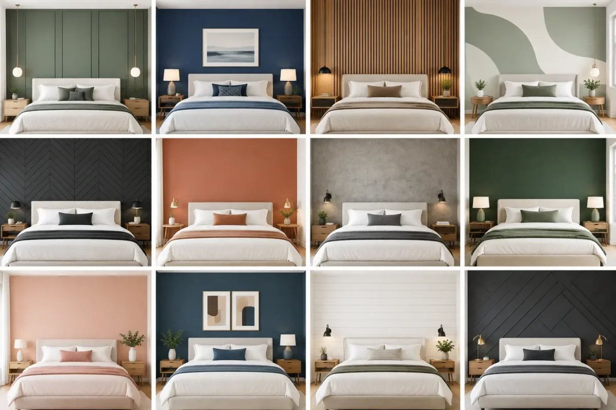
Texture trends are closely tied to a move away from stark white and cool gray interiors. Warm neutrals continue to lead because they create a flexible backdrop for changing furniture, artwork, and seasonal styling. Yet the new neutral is rarely flat. It has undertones, grain, shadow, and a tactile finish that changes gently throughout the day.
Earth-inspired shades such as clay, dune, almond, olive, cocoa, and weathered stone are particularly effective in textured wallpaper. They make a room feel grounded while allowing deeper accents in black, burgundy, forest green, or midnight blue. For more luminous spaces, pearl, champagne, and pale sand textures can reflect light without looking glossy or overly formal.
Dark texture is also gaining ground in libraries, lounges, dining rooms, boutique retail, and hospitality settings. Charcoal linen, deep brown grasscloth effects, and blackened plaster finishes create intimacy and visual depth. They need thoughtful lighting, however. In a room with limited daylight, layered lamps and wall washing help reveal the texture rather than letting it disappear.
A beautiful wallcovering must also perform. Residential selections can prioritize tactility and atmosphere, but commercial and hospitality projects often require more demanding specifications. Durability, cleanability, fire performance, substrate condition, and installation method should be addressed before the design is finalized.
For high-contact areas, consider commercial-grade, fabric-backed wallcoverings engineered for resilience. In food, wellness, retail, or family environments, easy-maintenance surfaces may be more appropriate than delicate fibers or deeply raised finishes. For branded projects, custom print wallpaper can translate a proprietary texture, illustration, or mural concept into a finish sized precisely for the wall.
Lighting deserves equal attention. Side lighting reveals embossing and weave more strongly than direct overhead lighting. This can be an advantage on a feature wall, but it can also expose uneven wall preparation. Professional installation and proper surface preparation are essential to achieving clean joins, consistent alignment, and a finish that looks intentional from every angle.
At Decorating Depot, textured wallcovering can be selected alongside custom mural and project-grade options, allowing a design concept to move from a single feature wall to a coordinated interior finish package. The result is greater control over appearance, scale, and performance.
Start with the feeling the space should create. A bedroom may call for a soft textile effect that supports rest. A restaurant may benefit from a deeper, more dramatic plaster texture. A corporate meeting room may need an elegant neutral weave that feels polished on video calls and in person.
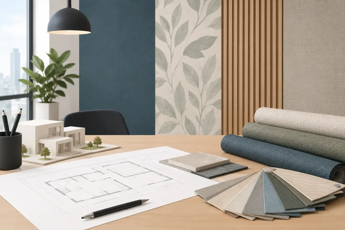
Then view the sample under the room’s actual lighting. Daylight, warm LEDs, and spotlights can all change the apparent color and depth of a textured surface. Place the sample beside flooring, cabinetry, fabrics, and metal finishes rather than assessing it in isolation.
Finally, consider scale and continuity. A subtle all-over texture can visually connect several rooms, while a larger embossed design is often strongest as a focal point. If the wall has doors, windows, and architectural interruptions, a low-repeat texture will usually look calmer than a highly structured pattern.
The best textured wallcovering does more than fill a wall. It gives the room a finish that feels deliberate, tactile, and built to last – a detail people may not immediately name, but will always notice.