A strong office wall branding makeover example does more than place a logo on a reception wall. It gives every arrival, meeting, and corridor moment a clear sense of who the company is. The most effective projects combine brand strategy, material performance, scale, and professional installation so the space feels considered from every angle.
Consider a growing professional services firm moving into a 12,000-square-foot office. Its new workplace has polished concrete floors, glass meeting rooms, and generous white walls, but little personality. The brief is clear: create a confident, premium environment that communicates expertise to clients while giving employees a stronger connection to the company culture.
The answer is not to cover every available surface. It is to identify the walls that carry the greatest visual and emotional value, then give each one a distinct purpose.
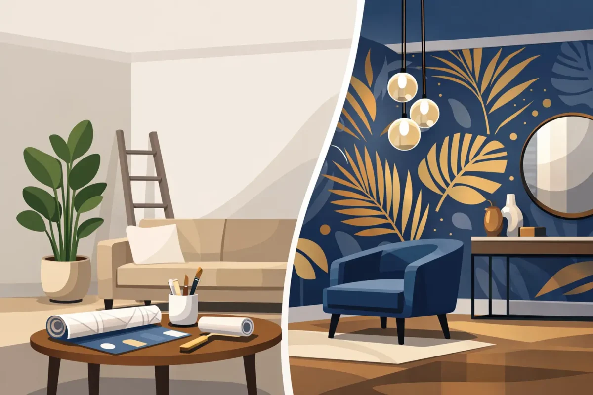
In this example, the reception wall becomes the first brand statement. Rather than applying a small vinyl logo to a painted backdrop, the design uses a custom textured mural in the company’s deep navy and warm neutral palette. A subtle abstract pattern references the firm’s field of work without becoming literal or overly corporate. The logo is positioned with generous negative space, allowing it to read clearly from the entrance while retaining a refined, gallery-like presence.
Behind the reception desk, a commercial-grade wallcovering provides the visual foundation. This matters because reception walls receive attention, photographs, and frequent contact. A project-suitable surface is more resilient than standard paint, easier to maintain, and less likely to show minor marks over time. If the wall sits near a busy entrance, a fabric-backed commercial wallpaper can be the better choice for long-term durability.
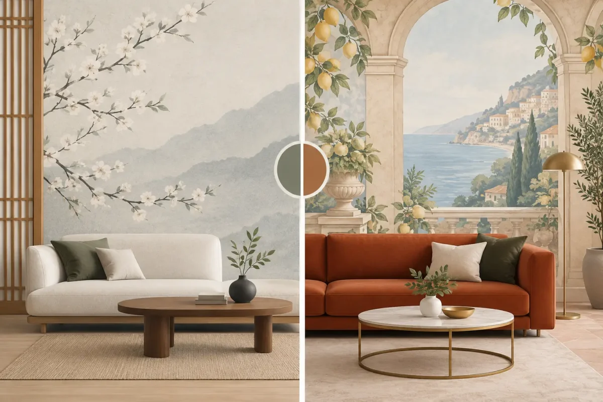
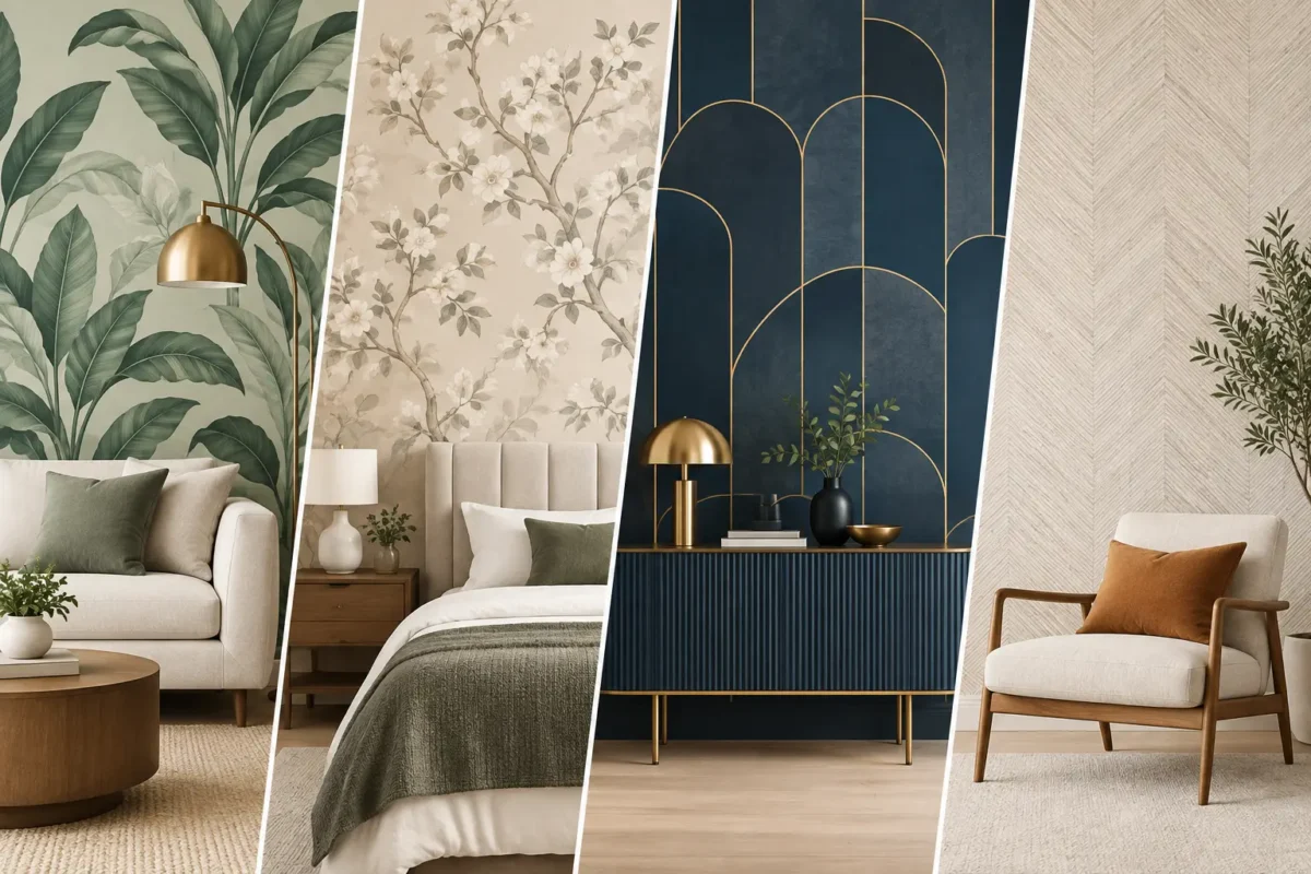
The design then moves beyond the lobby. A branded office should feel cohesive, not repetitive. In the main hallway, a custom mural presents the company’s point of view through a large-scale visual narrative: architectural linework, regional imagery, or an abstract interpretation of its services. In meeting rooms, quieter wallcoverings carry the same palette in a more restrained pattern. The result is a connected visual system rather than a sequence of unrelated feature walls.
A makeover succeeds when the investment follows the visitor and employee journey. The reception area is usually the priority, but it is rarely the only opportunity. A boardroom wall visible during video calls can become a valuable backdrop. A long corridor can reinforce culture and direction. Breakout areas can introduce energy, warmth, and a more human side of the brand.
For this office, the project is organized around four key zones:
Each zone has a role. The reception creates confidence. The corridor adds narrative. The boardroom supports credibility. The lounge makes the workplace feel less transactional and more welcoming.
This approach also protects the budget. A full-office makeover is not always necessary. Concentrating custom print wallpaper and bespoke murals on the most visible surfaces can deliver a stronger result than spreading a limited budget across every room.
Brand guidelines are often built for screens, stationery, and advertisements. Walls require a different interpretation. A color that works beautifully in a digital presentation may feel too intense across a 20-foot-wide surface. A detailed graphic may disappear when viewed from a distance, while a simple motif may gain impact at architectural scale.
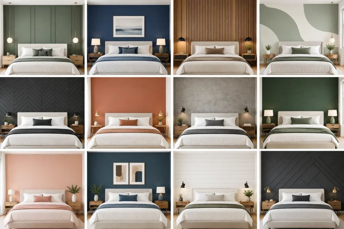
For the professional services firm, the design team extracts three core elements from the existing brand identity: a confident navy, a soft mineral gray, and a series of fine linear graphics. These are adapted into wall-specific compositions. The navy appears as a grounding color in reception. The gray creates calm in meeting spaces. The linework expands into the corridor mural, where it becomes a visual metaphor for progress, connectivity, and precision.
Typography also deserves careful consideration. Oversized mission statements can quickly feel dated, especially when they are too close to a company’s marketing language. A better option is to use concise, enduring phrases or values that employees genuinely recognize. Where text is used, it should be readable at the intended viewing distance and balanced against the surrounding architecture.
The goal is brand presence, not brand overload. A well-designed office can communicate its identity through color, material, form, and imagery before a visitor reads a single word.
Visual impact is only half the specification. Office walls face chair scuffs, fingerprints, cleaning routines, air-conditioning changes, and constant traffic. Material selection should reflect how each area will actually be used.
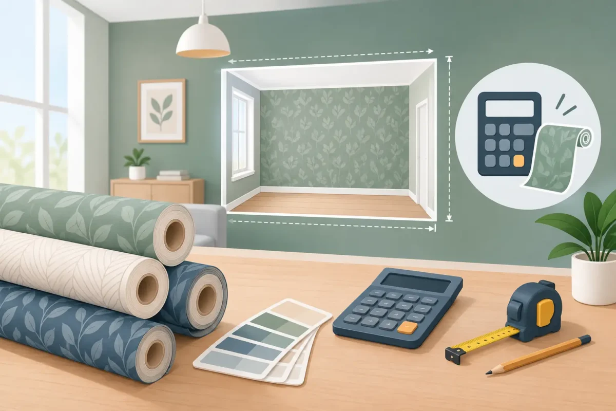
Custom print wallpaper is ideal when the project requires exact brand colors, tailored imagery, or artwork scaled to a particular wall. With advanced Canon printing technology and eco-friendly ink options, custom murals can deliver crisp detail and rich color while supporting a more considered interior specification. Accurate site measurement is essential, particularly where walls include doors, glass partitions, electrical points, or irregular corners.
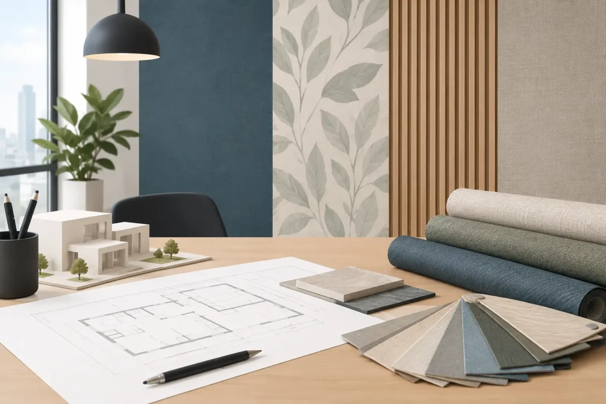
For high-traffic spaces, fabric-backed commercial wallpaper provides additional strength and a more substantial finish. Depending on the project requirement, commercial wallcoverings may also offer practical benefits such as washable surfaces, fire-retardant performance, and improved resistance to wear. These specifications should be discussed early, especially for hospitality, developer, healthcare, or corporate projects with formal compliance requirements.
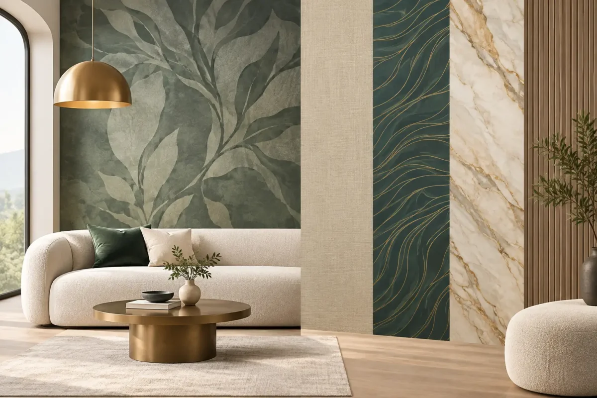
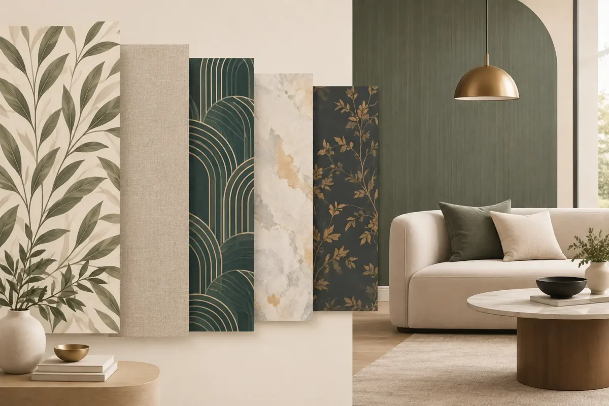
There is a trade-off between a highly detailed print and a timeless finish. A bold campaign-style wall can create immediate impact, but it may need updating as the business evolves. A textured wallcovering in brand colors is more flexible and often has a longer design life. The strongest projects frequently use both: a durable, neutral commercial base paired with one memorable custom mural.
A wall can look impressive in a digital mockup and still fail on site if scale, lighting, or sightlines are overlooked. Before production, assess how the wall is seen from the entrance, seated positions, elevator doors, and adjacent rooms. A mural should not be interrupted awkwardly by furniture or concealed behind a door swing. A logo should not sit too high above eye level simply because the wall is tall.
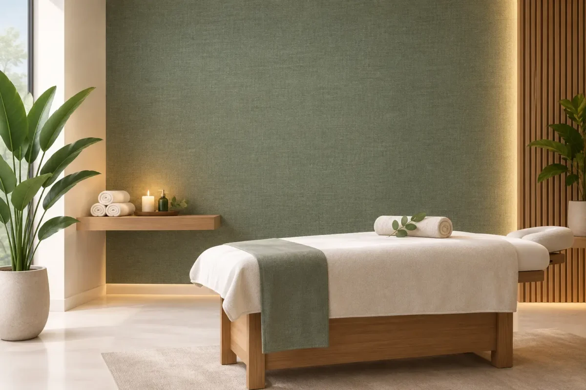
Lighting changes the perceived color and texture of every wall finish. Cool office lighting can make grays feel blue, while warm lighting can soften bright whites and deepen darker tones. Sample viewing under actual site lighting is a practical step that prevents costly surprises. Texture is equally important: a matte finish can reduce glare in boardrooms, while a tactile textile effect can bring warmth to a minimal reception area.
Professional installation is where design intent becomes a finished environment. Walls must be properly prepared, panels aligned precisely, and patterns matched without visible disruption. In custom mural work, even a small measurement error can affect the composition. Experienced installers understand how to manage these details so the finished wall reads as one continuous statement.
The completed office feels more intentional because every major surface supports the same visual language. Clients enter through a reception area that communicates confidence without excess. Employees walk through a corridor that reflects the company’s ambition. Meetings take place against polished, camera-ready backdrops. The office now performs as part of the brand rather than simply housing it.
For organizations planning a similar transformation, the best starting point is not a wallpaper pattern or a logo file. It is a clear decision about what people should feel when they enter the space. From there, custom murals, premium wallcoverings, and commercial-grade finishes can be selected to create an environment with beauty, durability, and purpose.
Decorating Depot brings this process together through extensive wallcovering selection, custom production capability, showroom consultation, and professional installation support. The most memorable office walls are not decorative afterthoughts. They are built to carry a brand forward, day after day.