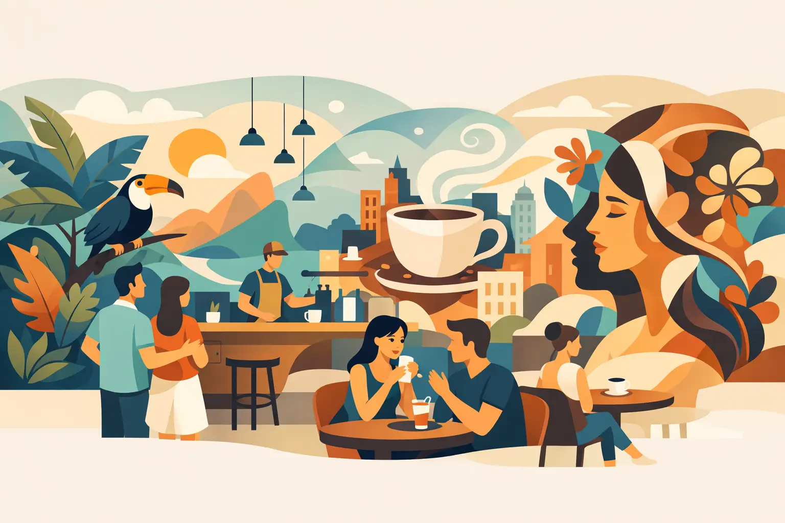
A cafe mural has roughly three seconds to make an impression: the glance through the window, the pause at the counter, the first photo taken before coffee arrives. The best top mural concepts for cafes do more than fill an empty wall. They establish a mood, strengthen the brand, and create a visual reason for guests to stay, share, and return.
For cafe owners, architects, and hospitality designers, the opportunity is not simply to choose a beautiful image. It is to select a wall finish that performs under daily traffic, changing light, food service activity, and frequent cleaning. A mural should look considered from every table, support the interior concept, and remain polished long after opening day.
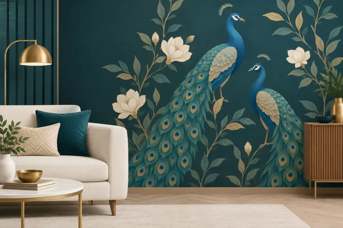
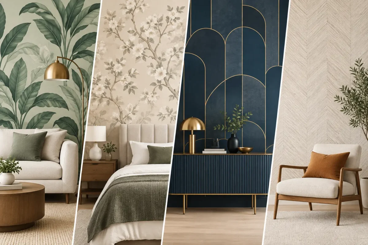
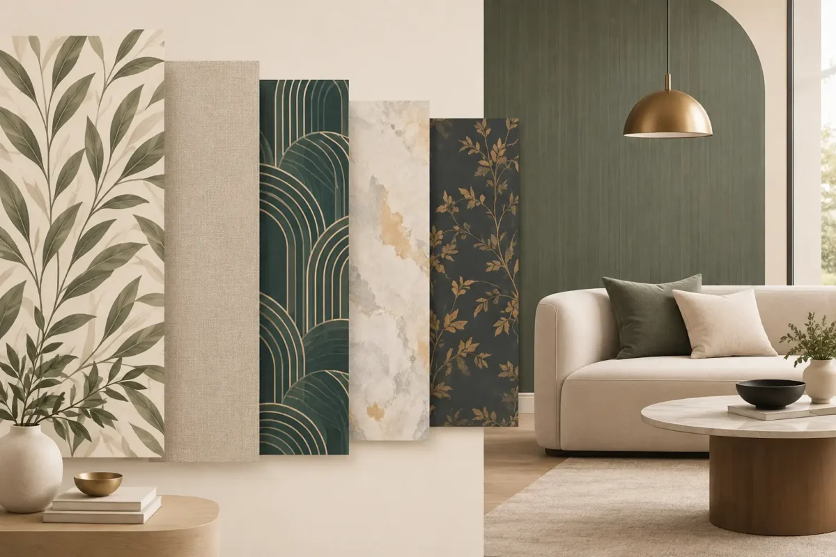
Lush foliage, oversized tropical leaves, climbing vines, and softly painted garden scenes remain strong choices for cafes. They introduce calm into compact urban interiors and pair naturally with timber, rattan, stone, brass, and warm lighting. A botanical mural can make a narrow seating area feel deeper or give a street-facing corner an inviting sense of escape.
The key is scale. Small, repetitive leaf patterns can feel decorative but visually busy, especially behind closely placed tables. Larger leaves, generous negative space, and a restrained palette tend to feel more premium. For a refined coffee bar, consider olive branches, citrus groves, or misty green landscapes rather than high-contrast jungle imagery.
A cafe often succeeds because it feels connected to its location. A custom mural inspired by local architecture, a market street, a shoreline, heritage shophouses, or a recognizable skyline can create that connection without becoming a souvenir-shop backdrop.
This concept works particularly well for destination cafes, hotel cafes, and independent operators with a strong neighborhood identity. The treatment matters. A hand-drawn map, monochrome linework, layered archival photographs, or a stylized illustration may age better than a literal photo enlargement. For commercial interiors, the mural should feel specific enough to be memorable while remaining aligned with the overall design language.
Not every cafe needs a figurative scene. Abstract murals are often the most flexible option for contemporary spaces, particularly where the menu, furniture, and lighting already carry a clear identity. Sweeping arches, mineral textures, painterly blocks, and tonal gradients can bring movement to a wall without competing with the room.
This is also a smart direction for brands planning multiple locations. A consistent palette and recognizable abstract motif can be adapted to different wall sizes while preserving visual continuity. Deep terracotta, espresso brown, sage, muted blue, and warm cream can reinforce a coffee-led atmosphere; brighter hues may suit a juice bar, dessert cafe, or youthful all-day concept.
The trade-off is distinctiveness. Abstract work needs a confident palette and a well-composed custom design to avoid looking generic. Test the colors under the cafe’s actual lighting before final production, particularly if the space uses warm pendants or abundant daylight.
A mural can make the product part of the interior story. Hand-illustrated coffee cherries, cacao pods, tea leaves, breadmaking details, pastry ingredients, or fruit harvests can give guests a richer sense of what they are ordering. The approach is especially effective for specialty coffee, artisanal bakeries, tea rooms, and cafes with a clear farm-to-cup or kitchen-made proposition.
Avoid using the mural as a large menu board. Too much text, too many product images, or overly literal food photography can quickly feel dated. Instead, let the artwork communicate craft and provenance. A fine-line illustration of coffee processing, for example, feels more enduring than a wall covered in drinks and promotional slogans.
A mural should not read like an oversized advertisement, but it can express the brand with great precision. A custom composition may use a cafe’s signature color, monogram, packaging illustration, founding motif, or a short phrase that guests associate with the business. This is particularly valuable when the wall is visible from the entrance or positioned behind the service counter.
The strongest branded murals give the logo room to breathe. Rather than placing it repeatedly across the wall, build an atmospheric backdrop around one discreet mark or one memorable line of copy. This preserves the premium feel while creating a recognizable photo moment.
For operators expanding across several locations, a brand-led mural system provides consistency without making every cafe identical. The visual language can remain constant while the composition, local color accents, or site-specific illustration changes from one outlet to the next.
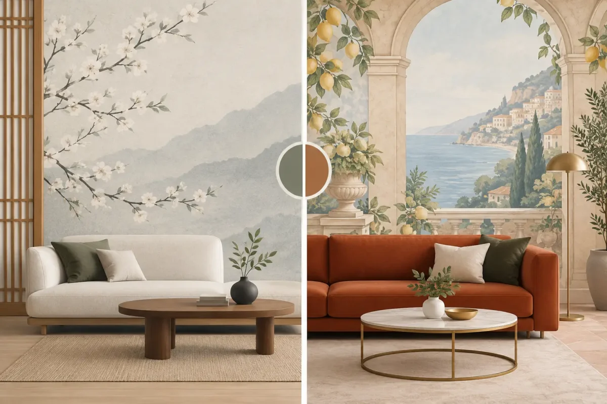
Small cafes frequently need a stronger sense of space. Murals with arched colonnades, painted windows, distant courtyards, textured plaster, or perspective-driven streetscapes can visually extend a room when handled with restraint. They are especially effective on a blank end wall where guests face the artwork from a natural viewing distance.
This concept depends heavily on accurate measurement and installation. A perspective mural that is cropped incorrectly, interrupted by awkward fixtures, or applied across an uneven surface loses its effect. Before selecting the image, account for doors, air-conditioning units, electrical points, banquette backs, and wall-mounted signage. Custom sizing is not a luxury here; it is what makes the illusion believable.
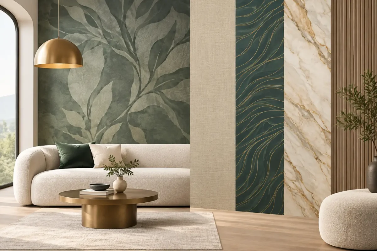
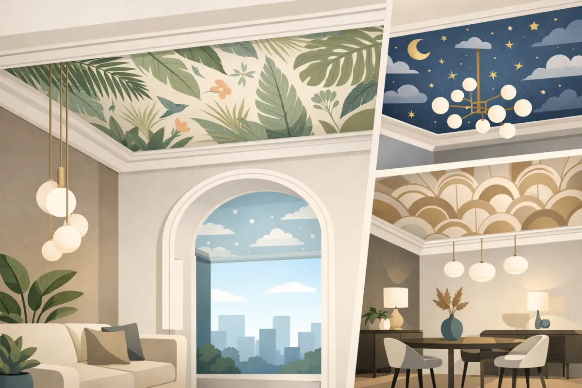
For hotel lounges, premium patisseries, and cafes designed for longer dwell time, consider murals with an atmospheric quality: cloud studies, ink-wash mountains, coastal horizons, linen-like textures, or softly layered stone patterns. These concepts create a composed backdrop for conversations and meetings without demanding attention from every corner of the room.
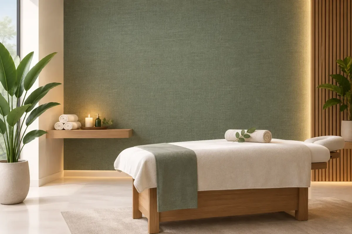
A tactile-looking mural can also deliver the warmth of artisan plaster, fabric, or hand-painted finishes with more predictable coverage and maintenance. It is a practical choice where designers want a high-end surface effect but require consistent color, controlled lead times, and easier replacement planning.
The most successful cafe murals begin with placement, not just imagery. A feature wall opposite the entry should communicate the brand immediately. A wall behind banquette seating needs to remain visually interesting at close range without overwhelming diners. A narrow corridor can handle rhythm, repetition, or directional artwork that draws guests forward.
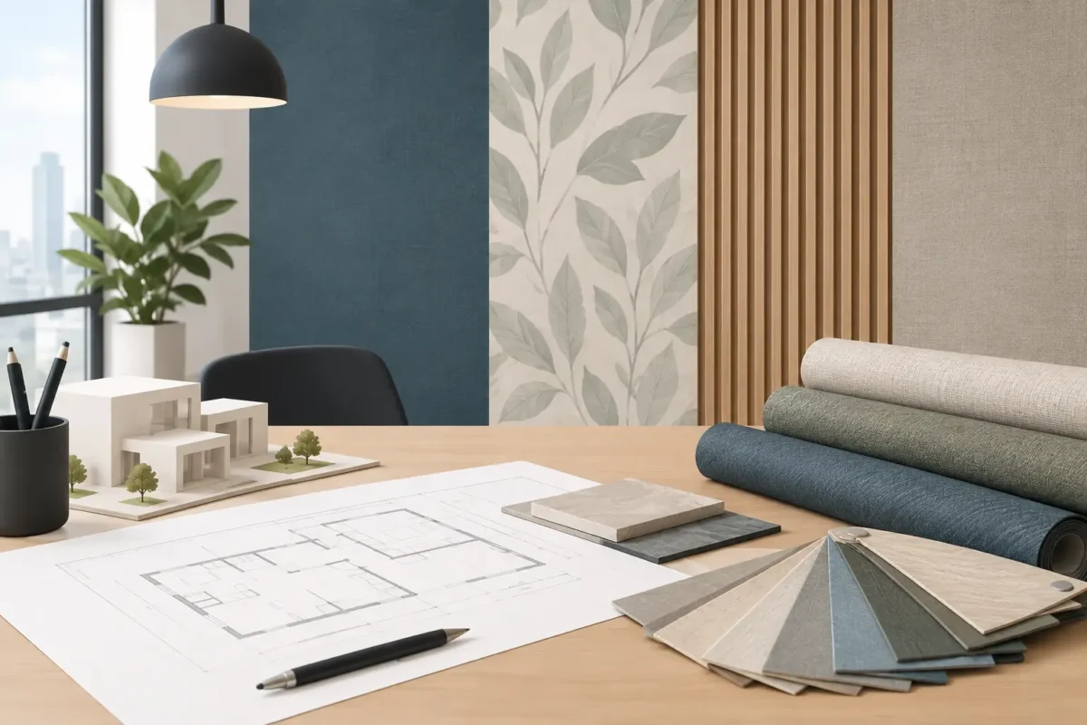
Walls close to food preparation, beverage stations, or high-touch seating zones require a more practical specification than a decorative wall in a private lounge. Commercial-grade wallcoverings can offer greater resistance to scuffs and routine cleaning than standard residential paper. Depending on the project requirements, designers may also need washable surfaces, fabric-backed construction, fire-rated options, or low-VOC and eco-friendly ink systems.
This is where material selection becomes part of the creative decision. A dark, richly detailed mural can be forgiving near busy seating, while pale designs may show marks sooner. Matte finishes are often preferred because they reduce glare from pendant lights and daylight, but the final choice should suit the wall condition and maintenance plan.
A mural should work with the room’s sightlines. Consider where guests queue, where they sit for the longest period, and which wall appears in photographs. A beautiful design placed behind shelving, menu screens, or a row of tall stools may lose much of its impact.
Scale is equally important. In a small cafe, one oversized subject can feel more sophisticated than numerous small elements. In a large dining room, a detailed panoramic scene may be needed to hold the wall. Request a digital visual or scaled mockup before production so the composition can be checked around furniture, lighting, and architectural features.
Color should support the operational reality of the space. Warm tones can make a cafe feel inviting during morning service, while cooler neutrals may better suit a calm, design-forward concept. If the brand uses bold packaging or colorful tableware, the mural may need a quieter palette to prevent visual competition.
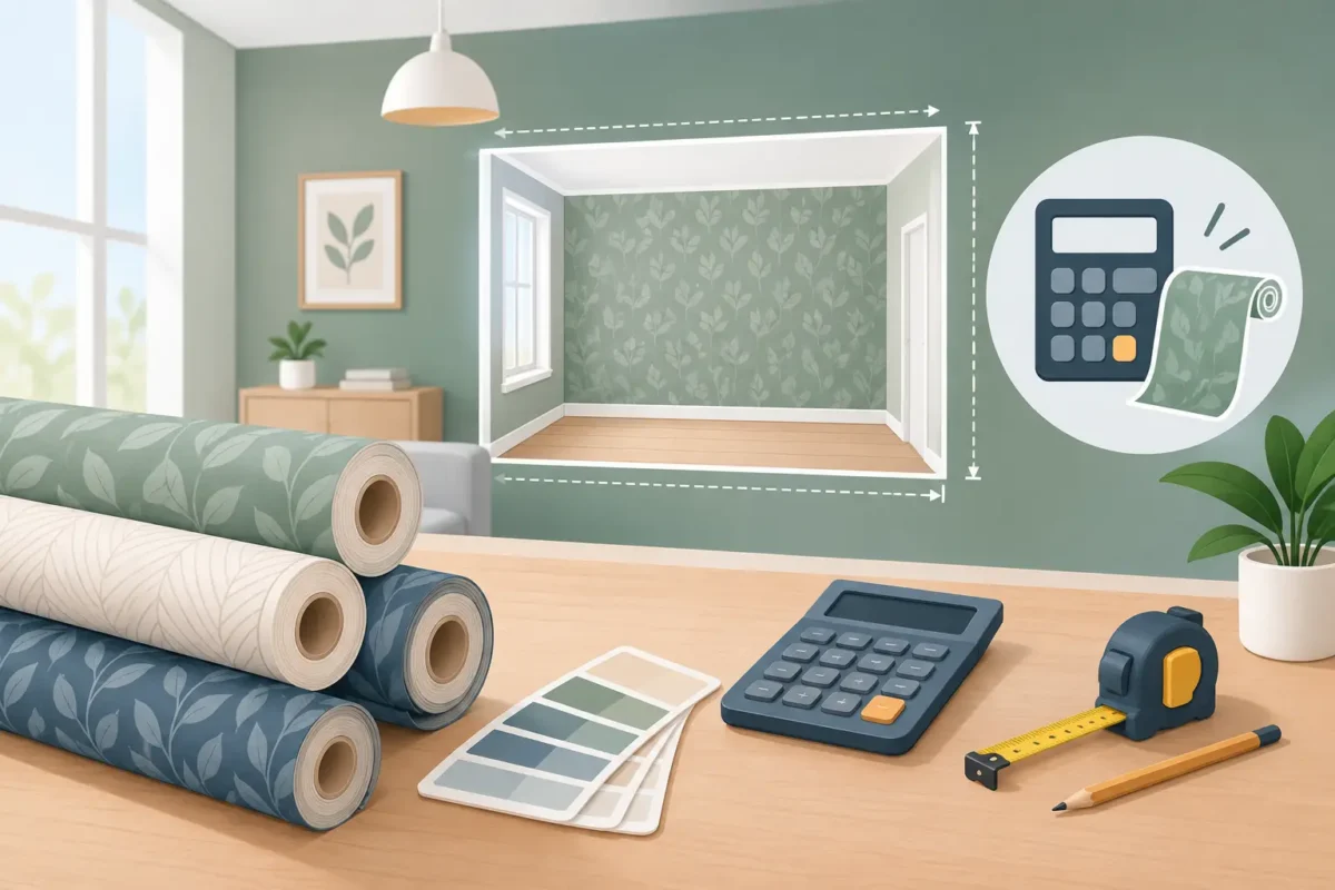
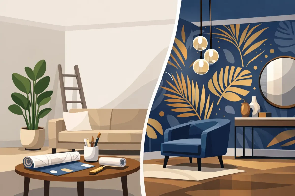
A cafe mural is only as successful as its execution. Accurate site measurement, wall preparation, color-managed printing, and professional installation protect the design investment. For custom work, image resolution is essential: artwork that looks sharp on a screen may not hold up when printed across a full-height wall.
Decorating Depot supports this process with custom mural production, advanced Canon printing technology, project-suitable wallcoverings, and installation expertise developed over more than 40 years. The right solution can be tailored to the wall dimensions, brand direction, traffic level, and desired maintenance standard.
Before approving a mural, stand in the space and imagine the guest experience at 8 a.m., at the lunch rush, and in the softer light of late afternoon. Choose the concept that still feels intentional in each moment, then specify a finish built to keep it looking that way.