A wall can set the tone for an entire room before furniture, lighting, or décor has a chance to speak. That is why italian designer wallpaper remains a go-to choice for clients who want more than surface decoration. It brings together artistic direction, material quality, and a sense of polish that instantly elevates residential and commercial interiors.
For homeowners, designers, and project teams, the appeal is not just about European styling. It is about control over mood, texture, scale, and finish. In the right setting, Italian wallpaper can make a living room feel tailored, a boutique hotel feel more memorable, or a corporate reception area feel quietly premium without appearing overstated.
Italian design has long been associated with balance – expressive, but disciplined. That same approach carries into wallcoverings. Patterns tend to feel curated rather than crowded, luxurious without becoming theatrical, and detailed in a way that rewards a closer look.
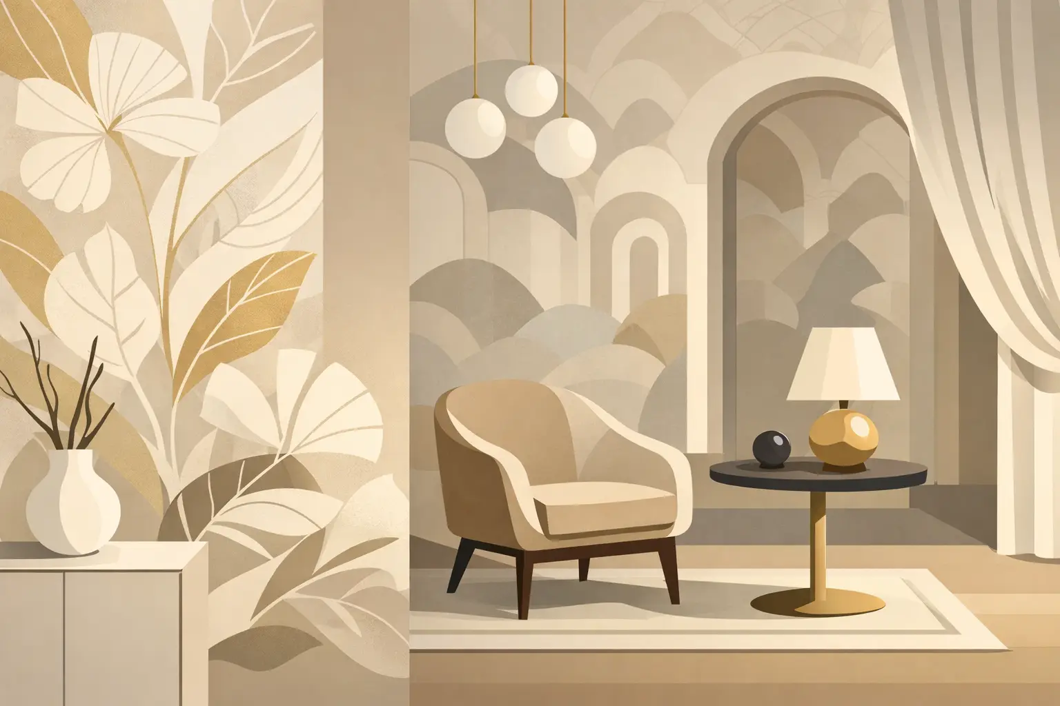
Many collections lean into layered texture, architectural geometry, soft metallic effects, linen-inspired surfaces, botanical motifs, and contemporary classics. The visual language is refined. Even when the pattern is bold, the execution usually feels controlled and sophisticated.
Material quality is another major differentiator. Premium Italian wallcoverings are often produced with strong attention to finish consistency, surface depth, and long-term wear. In practical terms, that can mean better resistance to fading, easier maintenance, and a more convincing tactile effect than lower-grade alternatives.
This matters in real projects. A feature wall in a private residence needs to retain its character over time. A hospitality setting needs beauty, but it also needs performance. A corporate interior may require a finish that supports branding while still standing up to daily traffic. Good wallpaper should do both.
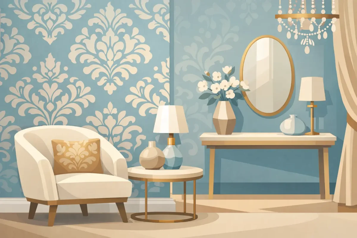
The strongest interiors use wallpaper with intention. Italian designer wallpaper works especially well when the goal is to create atmosphere with clarity. Instead of filling every wall with pattern, many high-end schemes use it to establish a focal point, frame a zone, or add warmth to otherwise clean-lined architecture.
In living rooms, textured neutrals and subtle metallics can soften hard finishes like stone, glass, and timber. In bedrooms, fabric-look surfaces and muted botanical prints create a calmer, more layered mood. Dining spaces often benefit from richer tones or more sculptural patterns that make the room feel complete even with minimal styling.
Commercial projects open up a different set of possibilities. In hotels, wallpaper can support the identity of a guest room, corridor, or lobby with greater depth than paint alone. In retail, it helps define brand character quickly. In offices, it can bring visual sophistication to boardrooms, waiting areas, and executive spaces without adding clutter.
The key is selecting a design that suits the function of the room. A dramatic oversized motif may look exceptional in a reception space but feel too visually active for a compact meeting room. A soft textural pattern may be ideal for a luxury bedroom yet too understated for a high-impact retail concept. Good specification always starts with use, not just appearance.
Selection is where aesthetics and technical thinking need to meet. A wallpaper that looks perfect in a catalog may perform very differently once scale, lighting, maintenance, and traffic levels come into play.
Pattern scale is one of the first decisions to get right. Large motifs create presence, but they need enough wall area to read properly. On smaller walls or in rooms with many openings, a finer texture or medium-scale repeat often works better. This is especially important in hospitality and commercial interiors, where visual rhythm affects how polished a space feels.
Color should also be assessed under the actual lighting conditions of the room. Warm light can deepen beige, bronze, and taupe tones. Cooler light can sharpen gray and silver finishes. Natural light changes throughout the day, which can either enhance the wallpaper’s complexity or flatten it depending on the surface.
Then there is finish. Matte textures create a quieter, more architectural look. Metallic or pearlescent surfaces reflect light and add energy. Embossed constructions add depth and can help disguise minor wall imperfections. There is no universal best option – it depends on the design objective and the practical demands of the space.
For high-traffic settings, durability becomes central. Commercial-grade wallcoverings are often the smarter choice for corridors, lobbies, restaurants, clinics, and offices where maintenance and longevity matter as much as appearance. In a private home, decorative flexibility may be the priority in lower-use areas, while family spaces benefit from surfaces that are easier to clean.
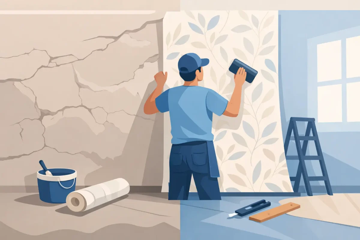
Even exceptional wallpaper can underperform if installation is not handled properly. With premium wallcoverings, precision is not optional. Pattern alignment, surface preparation, adhesive selection, and finishing details all affect the final result.
Italian wallpapers often feature sophisticated textures, directional prints, or specialty finishes that demand experienced handling. Any inconsistency in wall condition can show through. Any misalignment at the seam can interrupt the visual flow. On statement walls, these details are immediately visible.
That is why professional installation matters, especially for large-format walls, hospitality projects, and spaces where the finish must meet a high visual standard. Proper preparation reduces the risk of bubbling, lifting, or uneven adhesion. It also protects the investment in the material itself.
For project teams, this is not a minor operational issue. It is part of quality control. The specification, the substrate, and the installation method need to work together. A premium finish should look intentional from every angle, not almost right.
One of the strengths of Italian wallcovering design is its range. It can support intimate residential styling just as effectively as large commercial programs.
In homes, clients often choose Italian wallpaper for master bedrooms, formal living rooms, dining areas, stair walls, and powder rooms where visual impact matters. These are spaces where texture and design character can carry the room without relying on excessive decoration. The result feels more complete, and often more expensive, because the walls are doing real design work.
In commercial settings, the requirements broaden. Hotels need finishes that contribute to guest experience while remaining practical to maintain. Developers need reliable materials that support the quality positioning of their projects. Offices and branded spaces need wall finishes that communicate professionalism and design confidence.
This is where a full-service supplier becomes valuable. Access to broad collections, project-grade options, custom sizing, and installation support simplifies decision-making and reduces risk. For clients managing multiple rooms or large wall areas, consistency across product supply and execution is just as important as style.
At Decorating Depot, that combination of design range and technical support is what allows wallpaper selection to move beyond inspiration and into real project delivery.
Paint still has a place, especially when the goal is simplicity or frequent color changes. But paint cannot replicate the surface depth, detailing, and layered finish of premium wallpaper. If the objective is to create a signature wall or a distinctly upscale atmosphere, wallpaper usually offers more dimension.
It also solves a different design problem. Paint provides color. Wallpaper provides character. That difference is especially clear in spaces that need a stronger identity, such as luxury residences, reception areas, boutique retail, and hospitality interiors.
That said, not every room needs a patterned feature. Sometimes the best choice is an understated texture that reads almost like a custom wall finish. Sometimes one focal wall is enough. Sometimes a heavier decorative statement earns its place because the room architecture can carry it. Good design is about proportion and restraint as much as selection.
The best results come from seeing wallpaper as part of the total interior plan, not a last-minute decorative layer. When selected early, it can inform furniture, lighting, joinery, and material coordination. That leads to spaces that feel resolved rather than assembled.
For homeowners, this means choosing wallpaper that supports how the room should feel and function. For designers and architects, it means balancing visual language with substrate conditions, maintenance expectations, and budget realities. For developers and operators, it means specifying finishes that protect both the design intent and the long-term value of the property.
Italian designer wallpaper continues to stand out because it delivers on both fronts. It is expressive enough to transform a room and disciplined enough to suit serious project requirements. When design excellence and engineered performance need to coexist on the same wall, that balance is exactly what makes the difference.
The right wallcovering does not just decorate a space. It gives the room authority, texture, and a point of view that lasts well beyond the first impression.